Chapter 1: Color
Table of Contents
This dissertation chapter is a full-color, interactive document, originally formatted in HTML. It contains interactive plots, hyperlinks, and other dynamic elements. If you are reading this in another document format (PDF, DOCX, or paper), you are missing these dynamic elements. Please visit dissertation.jonreeve.com for the canonical edition of this text, and github.com/JonathanReeve/dissertation for its source code. Annotations are welcome in the hypothes.is sidebar to the right.
Introduction
Modernity is colorful. And literature of the early twentieth century, coincident with the modern, or modernist, period, is brighter, more colorful, and more visual than literature of the early nineteenth century: 91.5% more colorful. By this time, the fiction and poetry published in Britain, and by extension in much of the Anglophone world, contains more color words, more colorful objects, and more descriptions of color phenomena than it ever did, and measurably so. Color and visual phenomena become not only modes of description, ancillary to plot and narrative arc, but themselves become themes, subject matter, and organizing principles. By computationally modeling color in literature, in this chapter, and by contextualizing these results within the artistic and material history of the period, I will not only show the explosion of color with numeric precision, but I will show the workings of color in literature: it generic affiliations, its historical fluxuations, and its linguistic fingerprint. This chapter thus operates at the nexus of quantitative text analysis, color studies, and phenomenology.
Color has always been one of the most difficult subjects to study. It’s a classic epistemological problem. On the one hand, colors appear to be a stable set of cognitive categories that we learn in primary school: basic properties of the things around us. Upon closer examination, however, various complicating phenomena reveal color to be so conceptually elusive that it ultimately forces us to challenge the basis of knowledge itself. These phenomena include optical illusions, perceptual differences between individuals and speakers of other languages, and the blurred boundaries between imagination, cognition, speech, and writing. What literature, and art, do to this soup of phenomena is only to complicate them further. These issues make computational analysis all the more difficult to perform, and to interpret.
Up until now, color has largely been considered supplemental to a literary work—it colors a passage, or provides color to it, as if it were an afterthought. While color studies is strong in philosophy, philology, and physics, as well as the certain cross-disciplinary areas of the natural sciences, it is taken less seriously in literary studies of late. My contribution is to show, qualitatively as well as quantitatively, the ways in which color, as a site of phenomenological uncertainty, forms a locus at which many of the problems of modernism are engaged. Not only are modernist writers struggling with ways to write the visual experience with chromatic precision, but the tension between text and image is, I will argue, a central mode of this period’s writing. Reading modernist works in terms of color will give us a new perspective on the visuality we have largely taken for granted, and by positioning color at the center of this inquiry, we destablize the canon, and reinforcing it in other ways, by finding the most colorful, and colorless, works in British literary history.
This chapter continues to analyze the eye of modernism, and focus on the aspect of vision handled by retinal cones: color, hue, and brightness. Color forms an important part of the modernist project which aims, reprising Conrad, to make you see: to convey the visual experience to the reader, from imagination to imagination, via textual encoding. This chapter reveals modernist usage of color to be a vital entry-point into description, word-painting, subjectivity, and visual epistemology.
The centerpiece of this study is a quantitative analysis of color, in British fiction and poetry of the late nineteenth and early twentieth centuries. Since the phenomenon of color is so widely discussed, across disciplines—in philosophy, psychology, anthropology, physics, history, linguistics, and to some degree in literary studies—this study will of necessity be interdisciplinary. I use research on color perception from experimental psychology, for example, to inform an algorithmic design, which also inherits methods from color studies in other sciences. Although the primary method I employ here is quantitative, and its scope literary-historical, many of my findings are derived from close readings—ones which inform quantitative methods, and which inform further readings, and so on. This is a process known in computational statistics as Box’s Loop (Box). As statistician David Blei explains it, “we build a model, use it to analyze data, assess how it succeeds and fails, revise it, and repeat” (Blei 203).
The study of color, imagery, and other visual effects in literature has a long history, a fact which is revealed in the breadth of several bibliographies. Sigmund Skard’s 1946 The Use of Color in Literature: a Survey of Research lists over a thousand works, in several European languages, which discuss textual color as it appears in literature (Skard). Skard lists works of psychology, philology, etymology, semasiology, religion, ethnology, folklore, classics, and modern literatures in a dozen or so languages. Robert Doak’s 1974 Color and Light Imagery: an Annotated Bibliography lists nearly five hundred works (Doak). Doak’s categories are similar, but he adds symbolism, heraldry, and proverbs to his collection. The writings about color more generally are even more numerous. My path will be to chart a narrow path through this area, to interrogate the boundary between word and color.
In modernist studies, there have been a number of notable monographs dealing with textual color. Karen Jacobs’s The Eye’s Mind: Literary Modernism and Visual Culture explores “new kinds of visual relations” in American, British, and French modernist texts (Jacobs). Jacobs historices ocularity in modernism, citing “newly skeptical philosophical discourses of vision in the first half of the twentieth century … which led to what Martin Jay hs called a ‘crisis in ocularcentrism’”; the impact of “visual technologies” like photography and film; and the emergence of anthropology and sociology as academic disciplines. Jack Stewart’s Color, Space, and Creativity deals with the interaction of its eponymous concerns, in Virginia Woolf, D.H. Lawrence, Lawrence Durrell, Joyce Cary, and A.S. Byatt. Stewart argues, as I do here, that “Verbal equivalents of color and space are no mere adjuncts to narrative. They are means by which writers build imagined worlds and focalize characters’ sensibilities” (J. Stewart 15). Among Stewart’s primary interlocutors are visual artists like Van Gogh and Kandinsky, who compile new theories of the interactions of color. David Batchelor’s Chromophobia charts what he sees as an aversion to strong colors, among American writers of this era, leading to monochromatics in works such as Heart of Darkness and Moby Dick. His wide-ranging study includes correspondences with architecture and psychedelics, as in Aldous Huxley’s Doors of Perception (Batchelor and Books). Another monograph with a coinage for a title is Chromographia, by Nicholas Gaskill, who studies “inscriptions of color in writing” (Gaskill 7). Gaskill argues that, “whereas traditional empiricism casts chromatic qualities as deceitful overlays cloaking the real world, the combined efforts of psychologists, philosophers, dyers, and paint manufacturers promoted a view of colors as relational phenomena that cut across the reigning categories of subject and object, inside and outside, nature and culture” (Gaskill 8). (This view, of color complicating dichotomies like subject and object, is also that of May Sinclair, as we shall see below.) My work continues that of these scholars, although focused more on the difficulties of translating between text and imagination.
There is a somewhat shorter tradition of quantifying textual color, as well, which I will build from. The most famous study is probably that of William Gladstone, the classicist and British Prime Minister whose Studies on Homer and the Homeric Age (published in 1858, ten years before he became the British Prime Minister) argues that the ancient Greeks couldn’t see the color blue, and that blue is in fact a modern invention (Gladstone). He arrives at this conclusion from a thorough manual tabulation of color words in Homer.
There are also quantitative color word analyses, in linguistics and philology, by Seija Kerttula, whose English Colour Terms: Etymology, Chronology, and Relative Basicness mines literary and linguistic corpora to determine the chronological development of color terms in English; Sigfried Wyler, whose Color and Language: Color Terms in English finds the frequencies of color words in linguistic corpora, as well as their frequencies of use in metaphor; and Anders Steinvall, who in English Colour Terms in Context takes a cognitive-linguistic approach to studying color terms in the corpus Bank of English (Kerttula; Steinvall, English Colour Terms in Context; Wyler).
In literary studies, Élodie Ripoll’s Penser la couleur en littérature: explorations romanesques des lumières au réalisme is a highly effective diachronic study of several centuries of novels, mostly French, which finds not only that literature passes from a “chromatic poverty” (littérature pauvre en couleur) in the eighteenth century, to a nineteenth century whose color is “at the heart of its poetics” (Ripoll 10). Ryan Heuser and Long Le-Khac, of the Stanford Literary Lab, also study color words in this period, with a view towards changing levels of abstraction and concreteness in British novels. They find a “sharp rise” in color word proportions from 1785 to 1900: from 0.04% to 0.19%, more than a 290% increase (Heuser and Le-Khac 22). Most recently, Ted Underwood’s Distant Horizons: Digital Evidence and Literary Change begins with an analysis of a random sample of 347 volumes of fiction, and arrives at a similar result to mine, in fig. 1 below (Underwood 10).
But these quantitative analyses all use narrower definitions of the textual colors they measure. With the exception of Gladstone, whose manual tabulation allowed him to disambiguate senses, these studies typically measure color words according to their lexemes, undisambiguated by word senses. Think of the ambiguity between rose the color, and rose the past tense of the verb to rise. Orange the fruit, and gold the metal are similar examples (although in imagination, there may be little difference, as I argue later). In Heuser and Le-Khac’s appendix, for instance, they list all 50 color words they use, among which are included orange and gold (Heuser and Le-Khac 55). Similarly, Underwood reveals that his list of color words “is long enough to include colors like ‘cerulean,’ but there will always be chromatic experiences it leaves out and emotions that it mistakes for a color when tallying up occurrences of a word like ‘blue.’” (Underwood 9). As I will demonstrate below, color word ambiguity and polysemy are much more problematic than these confessions suggest.
The algorithms I develop below not only address these problems with the counting of color words, but handle the larger problem of extracting a spectrum of visual information from text. In technical terms, it is a probabilstic model for named entity recognition (NER), trained on a weighted synthesis of color-word mappings of the past century, as well as lexicographical data, and crowdsourced, image-based data from across the Internet. But put succinctly, it is an imagination machine: like a human reader, it is given textual input, and returns visual information: in this iteration, it is color and its distributions. Not only does it see the word avocado and imagines #568203, or leisure and imagines #445d60, but is capable of imagining verbs, nouns, and abstract concepts, as well. This is all described in detail in the experiment section below.
My study contributes to the understanding of textual color, not only by showing that modernist literature is colorful, and that it is 91.5% more colorful (that is, with more precision), but by analyzing color words more holistically, to show the way which visual mechanisms operate in literature. So, I am less concerned with the what of this chromatic explosion in modernism, as I am the why and the how. Regarding the why, there are important contexts and backgrounds to this visual turn: the cultural and historical climate of the early twentieth century; intermedial cross-pollinations between writers, visual artists, and filmmakers; literary and aesthetic theories of the day; literary-generic and market considerations; and material histories, such as the sudden commercial availability of cheap synthetic dyes. I begin the chapter with these contexts.
From there, I introduce some problems with color analysis which inform the algorithmic design: the epistemology of color words and their literary/linguistic functions, which complicate the process of encoding this process into a computer program. Two case studies help to illustrate these problems: a study of Virginia Woolf’s To the Lighthouse, and another of James Joyce’s A Portrait of the Artist as a Young Man.
Next, I describe the what: the experiment itself, the design of the algorithm, the data sources. These are not technical details, I must emphasize, but are crucial decisions, informed by the psychological and philosophical research in color studies, and which defines the computational work to follow. Again, in a crucial sense, the algorithm is the criticism.
Finally, as literary scholars, we know that modernism is colorful. But what is missing is the how, and that is where I conclude this chapter: how, precisely, color appears in text, how it hides in text, and what it achieves in its contexts. I show how genres which were growing during this period, like travel novels, and children’s literature, contribute to this explosion of color, along with genres like love stories, psychological fiction, and detective fiction. I show how trends within these genres—what critics have called literary impressionism, for instance—heighten the senses of the narrators, and increase the likelihood of color descriptors. In short, I show the workings of textual color in literature.
The Problem: Modernity’s Explosion of Color
In Virginia Woolf’s meta-essay, “The Decay of Essay Writing,” she argues that her moment in history “has painted itself more faithfully than any other in a myriad of clever and conscientious though not supremely great works of fiction; it has tried seriously to liven the faded colours of bygone ages” (Woolf, Selected Essays). While she does not use “painted” or “colours” exclusively in their literal sense, she gives the distinct impression that modernity is brighter, and more colorful, than the previous age. The first of my analyses puts this hypothesis to the test, inferring colors from a corpus of hundreds of thousands of novels and poems, in order to answer the question of whether twentieth century writers are more colorful, or more descriptive, than their predecessors. They are.
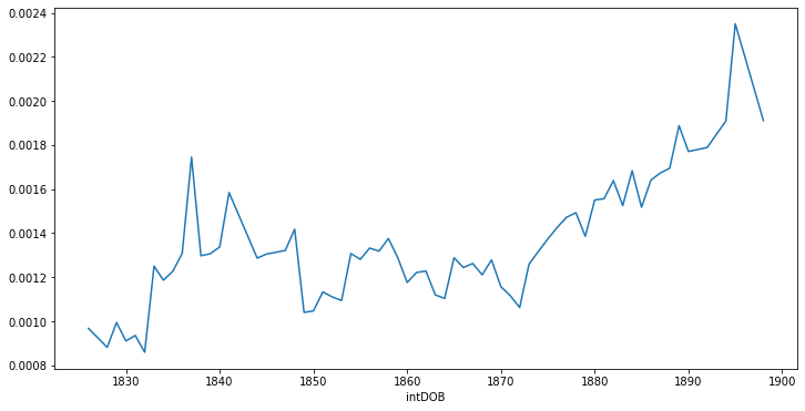
There is a tremendous increase in the proportions of color words, color expressions, and colorful objects, in British literature at the turn of the twentieth century. Fig. 1 shows the proportions of these colors, in hundreds of thousands of novels and poems, and how they correlate with their authors’ years of birth. Since the generation writing in the high-modernist decades of the 1910s and ’20s is born in the 1870–1900 range, give or take a decade, we see a huge jump in color during this period. This is Woolf’s generation quite literally “livening the faded colours of bygone ages.”
I use the word generation advisedly, as does Woolf. The author’s year of birth might seem like a strange choice of a variable, for an analysis of this sort, since virtually all quantitative studies of color words use publication dates. But as I will explain below, there are strong generational currents that make this choice necessary. Woolf herself divides then-living writers into “Edwardian” and “Georgian” camps, as we shall soon see.
These trends are the results of the complex quantitative analysis described below, which analyzes a very large corpus, using a deep imagination algorithm to identify not only direct expressions of color, but implied visual information, as well. Let’s begin by examining the historical context to this phenomenon: the trends in literary and art history, and social / material conditions for this increase in color.
On or About December, 1910: a King, an Art Exhibition, and a Comet
In her oft-cited essay from 1924, “Mr Bennett and Mrs Brown,” Virginia Woolf famously asserts that December, 1910, was a turning-point for human character:
“My first assertion is … that everyone in this room is a judge of character. Indeed it would be impossible to live for a year without disaster unless one practised character-reading and had some skill in the art. … And now I will hazard a second assertion … that in or about December, 1910, human character changed.” (Woolf, Collected Essays by Virginia Woolf. Vol. 1 320)
The phrase “in/on or about December, 1910” appears over 1,192 times
in publications since
1924,Mostly
since 1980. I derive this total from raw
data from this 5-grams archive, via Google Books.
and is the title of a monograph on the early Bloomsbury
group (Stansky). In
it, Peter Stansky cites a number of epoch-making events that straddle
1910. Among them are: the death of King Edward VII, signaling the end of
the Edwardian era; Roger Fry’s London exhibition, “Manet and the
Post-Impressionists”; and the passing, in early 1910, of Halley’s Comet.
Each of these is worth addressing, not just as significant events of the
new decade, but as events which contributed to the change in the
literary ocularities that we see manifested in the figures above.
First, let us consider the end of the Edwardian era. The death of the
“rich and vulgar” Edward VII, in May 1910, along with the coronation of
George V in 1911, while less culturally significant than other events,
nonetheless provided for many Britons a useful shorthand for
circumscribing an era of extravagance (Stansky
1).Paul Thompson’s study of the Edwardians finds that “the
top 1 per cent of Edwardians … owned 69 percent of the national
capital,” a wealth, and an inequality, which “was the highest in modern
British history and probably then the highest in the western world”
(Thompson 2).
We will return to this later, when dealing with material conditions of
commercial pigmentation.
Woolf’s essay begins by dividing early twentieth century
writers along these lines: “Mr. Wells, Mr. Bennett, and Mr. Galsworthy I
will call the Edwardians; Mr. Forster, Mr. Lawrence, Mr. Strachey, Mr.
Joyce, and Mr. Eliot I will call the Georgians” (Woolf, Collected Essays by Virginia Woolf. Vol.
1 320). Woolf’s list of British writers is very nearly
in chronological order, by date of birth. The most senior of the
“Edwardians,” H. G. Wells, was born in 1866, quickly followed by Arnold
Bennett and John Galsworthy in 1867, while the “Georgian” E. M. Forster
was born a decade later in 1879, followed by Lytton Strachey in 1880,
James Joyce in 1882 (as with Woolf herself), D. H. Lawrence in 1885, and
T. S. Eliot in 1888.
This generational difference—the motivating factor behind the analysis shown in fig. 1—Woolf sees as manifest in an internal cohesion of the writers’ works. While among the Georgians, or, in a proto-modernist work like Tristram Shandy, Woolf argues, “everything was inside the book, nothing outside,” the Edwardians, in contrast, “were never interested in character in itself, or in the book in itself. They were interested in something outside. Their books, then, were incomplete as books, and required that the reader should finish them, active and practically, for himself” (- Woolf, Collected Essays by Virginia Woolf. Vol. 1 327).
Woolf’s concern for “character in itself” and “the book in itself” hearkens back to the autoteleological aphorism of Aestheticism, “l’art pour l’art,” or “art for art’s sake.” (Aestheticism, the artistic and literary movement of the 1890s, was born of the late Victorians, a generation for whom modernists / “Georgians” felt affinity.) In fact, we might well call Woolf’s essay “Mrs. Brown for Mrs. Brown’s Own Sake.” But what is more important is the mode in which this autotelos is enacted: sight. Sight is useful, or useless, unto itself: it is the progenitor of action, and precedes it.
In comparing Wells, Bennett, and Galsworthy, by imagining the way each novelist would treat Mrs. Brown, Woolf’s train car neighbor, Woolf uses visual and ocular metaphors to contrast their writing styles: Wells would “project a vision on the window-pane” of a utopian world without Mrs. Brown. “And what would Mr. Galsworthy see?”, Woolf asks (- Woolf, Collected Essays by Virginia Woolf. Vol. 1 327). (Crucially, this is not “what would Mr. Galsworthy write,” but what would he see.) He would see a symptom of a failing society, she replies. Bennett, however, “would keep his eyes in the carriage” (- Woolf, Collected Essays by Virginia Woolf. Vol. 1 328). Later, in describing Strachey’s “against the grain” biography Queen Victoria, Woolf argues that “Mr. Strachey has had to open our eyes before he has made us see” (- Woolf, Collected Essays by Virginia Woolf. Vol. 1 335).
This “make us see” is the very same which Conrad identifies as his goal, in the preface of The Nigger of the Narcissus, which I quote in the introduction. It is the goal of the novelist, according to Conrad, and to Woolf. In fact, Woolf acknowledges Conrad, in this essay, as one of the only exemplary writers available to the 1910 generation, for his vision—that is, for his prose treatment of visual phenomena.
As Woolf sees it, the Georgians distinguish themselves through their sight—their eyes are “in the carriage” with Mrs. Brown, rather than lost in utopias, or concerned with grand societal problems. They see Mrs. Brown in detail, but they are not carried away with detail itself, and do not attempt to paint a complete picture. It is no coincidence that “Mrs. Brown”—Woolf’s invented name for this real person—is also the name of a color. Woolf’s description of her lists things that are likely brown, without needing to use the word: she is “threadbare,” and wears “clean little boots” (- Woolf, Collected Essays by Virginia Woolf. Vol. 1 323). Her appearance suggested to Woolf “extreme poverty” without needing “rags or dirt.” Her only line of dialogue is, “can you tell me if an oak tree dies when the leaves have been eaten for two years in succession by caterpillars?”—a scene again full of brown things, like dead trees. In contrast, the villain of this story, Mr. Smith, is considerably richer, sporting “blue serge.”
An even more substantive event of the year is Roger Fry’s exhibit in 1910. The art critic and painter Roger Fry, a late entry into Woolf’s Bloomsbury group of friends, organized, at the Grafton Galleries, one of the most influential British art exhibitions of the early twentieth century: “Manet and the Post-Impressionists,” the exhibition which coined the term “post-impressionist.” Like its predecessor, impressionism, post-impressionism places greater importance on bright color and form than in representation, drama, or chiaroscuro. Its apotheosis, in terms of this emphasis, is fauvism, the trend, circa 1905–1908, for reducing paintings to large swaths of extremely bright colors.
To speak precisely, post-impressionist paintings are, according to my
image analysis, 37.4% brighter than European paintings of the early
nineteenth
century.I arrive at this figure by querying
Wikidata for paintings labeled with the movement
“post-impressionism,” then querying for paintings created between
1800–1850, downloading one hundred images from each category, and
finally by computing K-means centroids for their luminosity in HSL color
space (hue, saturation, luminosity). Although we must account for some
fading of the paintings’ colors over time, this figure confirms my
intuitive sense (and that of many art critics) that post-impressionism
was an exceptionally bright artistic movement.
The exhibition flaunts this new brightness, featuring the
titular Edouard Manet, along with Paul Cézanne, Paul Gauguin, Maurice
Denis, Vincent van Gogh, and other painters known for their use of
bright color. It was highly controversial. A cartoon in the November
1910 issue of The Bystander, as shown in fig. 2, illustrates the controversy (The Bystander
375). A segment of the cartoon labeled “you arrive thus”
depicts two gentlemen arriving at the exhibition: one half-asleep, and
the other, alert. The following segment, labeled “and depart thus”
depicts the sleepy man suddenly alert, and the alert man with buckled
knees, wiping the sweat from his brow. Another corner of the cartoon
depicts an appreciative look from “an American art student who liked the
colour harshness.” Finally, a tableau at the bottom of the page shows
four men and three women, in genteel hats and costume, doubled over in
laughter. The caption is “From the Pictures’ Point of View.”

Even Roger Fry’s own comment on his exhibition had, in his biographer Virginia Woolf’s phrase, “an apologetic air” (Woolf, Roger Fry 153). “There is no denying,” Woolf quotes Fry as saying, “that the work of the Post-Impressionists is sufficiently disconcerting. It may even appear ridiculous to those who do not recall the fact that a good rocking-horse has often more of the true horse about it than an instantaneous photograph of a Derby winner.” Fry contends that an abstracted, artificial reproduction, due to its artificiality, is, paradoxically, more real than its realistic depiction. This introduces a theme which we shall see several more times: that raw colors, abstractions, and blocky, Platonic shapes, like that of a rocking horse, are somehow more faithful to the phenomenological aesthetic experience than that of ostensibly objective representation, such as photography.
The reactions to this exhibition were not an exaggeration. As Woolf put it:
“it is difficult in 1939, when a great hospital is benefiting from a centenary exhibition of Cézanne’s works, and the gallery is daily crowded with devout and submissive worshippers, to realize what violent emotions those pictures excited less than thirty years ago. … The public in 1910 was thrown into paroxysms of rage and laughter. … they were infuriated. The pictures were a joke, and a joke at their expense. … The pictures were outrageous, anarchistic and childish. They were an insult to the British public and the man who was responsible for the insult was either a fool, an impostor or a knave” (Woolf, Roger Fry 153–54).
“Anarchistic and childish.” These reactions, while extreme, bear some examination. First, “childish” is telling, given the well-documented preference among children for bright colors (Boyatzis and Varghese; Nanda et al.). In fact, Woolf relates the experience of fellow Bloomsbury member Desmond MacCarthy, to whom “parents sent … childish scribbles which they asserted were far superior to the works of Cézanne” (Woolf, Roger Fry 154). Second, the reaction that the paintings were “anarchistic” speaks to a related thread of so-called primitive art that was incipient in modernism. These are observations which art critic C.J. Holmes also makes of the exhibition:
The tradition of Post-Impressionism, then … is the expression of a personal vision: 1. Through the methods, first applied to oil-paintings by the Impressionists, which aim at the greatest possible vibrancy and luminosity of colour, obtained by the juxtaposition of pure bright pigment in small separate touches. … 2. Through rigid simplification on the lines of the Orientals and of Daumier, in which the means of expression are reduced to line and colour … (Holmes 19)
The “pure bright pigment in small separate touches” is a technique
borrowed from impressionism, and its sister style, pointillism: it is
one which leverages the ocular and neurological interactions of color to
produce new
colors.See the section on
impressionism below for a more thorough treatment of color theory in
impressionism, and its relation to literary impressionism.
The “lines of the Orientals” speaks to the influence of
far Eastern art—in particular Japanese woodblock prints—that would
become important for modernism, and which would reach to its climax in
the 1920s, with such works as “The Waste Land” in 1922, and the first
British performance of Stravinsky’s ballet “The Rite of Spring” in 1921.
As we will see later, rich visual descriptions are often correlated with
geographic, temporal, or imaginitive distance, and so appear often in
travel narratives, period pieces, science fiction, and other genres of
distance.
But the point I am making here is not only one of the art-historical milieu in which modernist literature is steeped, but that this way of thinking about color perception is crucial to understanding the use of color words, in descriptive prose or poetry, since color words, like “pure bright pigment,” are single brushstrokes that belong to their greater pictures—that is, their textual context.
The influence of this exhibit, for the writers, thinkers, and artists living in London, is difficult to overestimate. This is partially owed to its colorfulness: it was one of the first art exhibitions in Britain to be about color. Narrative, and to a lesser extent representation, play lesser roles in these paintings than does color. Although the impressionists of the prior decades always had noticeably bright color-palettes, and were more interested in the interplay of color than anything else, the post-impressionists of this exhibit attacked their viewers with color. This is the climate in which the colors of modernist literature were written.
A third significant event of the 1910s was the arrival, in the early part of the year, of Halley’s Comet. A literal once-in-a-lifetime event, happening only every 75 years, the comet had long appeared as an omen at various turning-points in British and world history. It appeared in the year of the Norman conquest of England in 1066, and was depicted in the Bayeux Tapestry, which is its first known representation. In the late seventeenth century, British astronomer Edmond Halley, in dialogue with Isaac Newton, noted its periodicity. Its arrival in 1910 was special, however, since it would come closer to the earth than ever before. Furthermore, recent developments in spectrometry found, in 1909, that its tail contained the poisonous gas cyanogen (Stoyan 147). This caused mass hysteria in Europe, where gas masks, bottles of oxygen, and “comet pills” were sold in great quantities.
Comet-panic was fueled by comet-related catastrophe in science fiction: Edgar Allen Poe’s story “The Conversation of Eiros and Charmion,” Jules Verne’s novel Hector Servadac (or “Off on a Comet,” in English editions), Camille Flammarion’s La Fin du Monde, and H.G. Wells’s 1906 In the Days of the Comet, the only one to speculate about positive effects of extraterrestrial gases. There, the comet’s gases have the effect of opening the minds of the world’s denizens, allowing them to engage in free love and polyamory. In all of these narratives, however, comets are not mere omens, “shooting stars” in the otherwise static firmament, existing only as signals for astrologers, but are informed by the astronomical knowledge that they are large physical objects which may crash into Earth.
Although British intellectuals, on the whole, did not buy in to this comet panic, or liberation, its effects were still felt. John Maynard Keynes, an economist in the Bloomsbury Group, wrote, “the comet’s tail last night produced a very odd state of affairs in the air here. It was oppressive & electric & rather exciting” (Stansky 120).
George Dangerfield’s influential 1935 history, The Strange Death of Liberal England, begins with the 1910 appearance of Halley’s Comet, and the death of King Edward VII. “Upon the chill and vacant twilight blazed Halley’s Comet – which, visiting the European heavens but once in a century, had arrived with appalling promptness to blaze forth the death of a king” (Dangerfield 19). He writes, in his characteristically dramatic style, that 1910 is “a landmark in English history, which stands out against a peculiar background of flame. For it was in 1910 that fires long smouldering in the English spirit suddenly flared up, so that by the end of 1913 Liberal England was reduced to ashes” (15-16).
These three events are reflective of, if not emblematic of, the changes in human character which Woolf identifies as happening in 1910: they signal the strange death of the old beige order, and the coming of a new, brightly colored era. These are phenomena we see in the results of my computational analysis below. But to understand the wave of color in 1910, we need to go back a little further, to the 1890s.
The Yellow Nineties: Decadence, Cosmetics, and Artificiality
Despite what Woolf would have us believe, human character, and with it a sense of colorfulness and brightness, didn’t change all of a sudden in 1910. Rather, there was a gradual change, with a large number of causes. Even the 1910 post-impressionism exhibit had its origins a decade or more earlier, in France. One of the most significant of these cultural roots, and one to which Woolf alludes, is the environment of the late Victorian period: the 1890s, or “yellow nineties” as it was often known. This period saw a trend towards the celebration of artificiality: synthetic pigments and bright colors, exemplified by artistic movements such as the aestheticists and the pre-Raphaelites. Yellow was its color in more than one respect. As Frances Winwar puts it:
The color had been a favorite one with Rosetti, Morris and Burne-Jones who had first discovered it in the richness of medieval panels, then nearer at hand in the sunflower of rural gardens. … There was something vivid and daring about the color, something of the times, like the golden bloom of the age on a century that was nearing its close—not to death but to greater achievement. Yellow and fin-de-siècle began to have connotations open to many meanings but all leading to a definable sense of modernity, challenge, emancipation. People were no longer afraid to live. … The public became yellow-conscious. (Winwar 239)
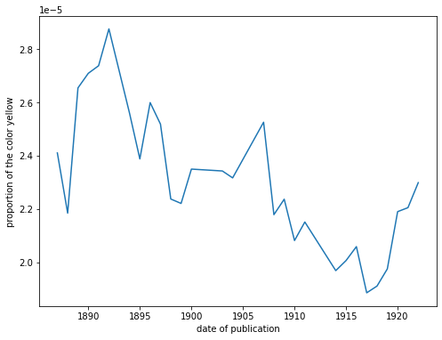
Yellow had become a symbol of modernity. It was a bright color, comparatively rare in nature—the color of the sun, of gold, and of sunflowers. It became the symbol of aestheticism. Fig. 3 shows the proportions of the hypernym yellow, according to the publication dates of the works where it appears. This isn’t just the word yellow, I should reiterate, but its hyponyms, associated lemmas, and objects that are typically yellow-colored: lemons, sunflowers, and so on. Although proportions of textual color generally increase with time, in literature of this period, yellow was never higher than it was in the 1890s.
Richard le Gallienne, English poet and essayist, and a prolific writer throughout the nineties, described in his 1896 Prose Fancies what he called “The Boom in Yellow,” in which colors like green and white had fallen out of fashion, to be replaced with yellow. This essay makes his Prose Fancies the work with the highest proportion of yellow in the corpus:
Innocence has but two colours, white or green. But Becky Sharp’s eyes also were green, and the green of the aesthete does not suggest innocence. There will always be wearers of the green carnation; but the popular vogue which green has enjoyed for the last ten of fifteen years is probably passing. … now the triumph of yellow is imminent. Of course, a love for green implies some regard for yellow, and in our so-called aesthetic renaissance the sunflower went before the green carnation—which is, indeed, the badge of but a small schism of aesthetes, and not worn by the great body of the more catholic lovers of beauty. (Gallienne 85–86).
Le Gallienne refers to the green carnation, a frequent lapel
adornment of the London aesthetes in the nineties. As carnations are not
naturally green, but must be dyed to achieve this color, using a
blue-green aniline
dye,A synthetic dye. See the
section on materialities below.
this symbolized the artificiality prized by aestheticism,
namely, unnaturally bright colors. As Joseph Valente and others have
noted, they were “an aestheticist emblem of imaginative artifice … and a
badge of the homosexual subculture of fin-de-siècle England” (Valente 251). Oscar Wilde reportedly
bade his entourage wear green carnations at the opening of Lady
Windermere’s Fan, in order to “annoy the public” (Sturgis
423). When asked why he wanted to annoy the public, Wilde
replied, “it likes to be annoyed.”
The Green Carnation is also the title of Robert Hichens’s 1894 roman à clef, first published anonymously, which satirizes Wilde, his relationship with Lord Alfred Douglas (not yet then public), and his coterie. Although it uses colorful description in a parodic mode, its parody is achieved by overemphasizing color. Here is a passage from its opening pages, annotated with the colors inferred from the computational color model I will soon introduce:
(Hichens)
There are some unusual color descriptors here: “soft lemon,” “gilt,” “brightest gold.” And where the colors are more conventional, the objects they describe are unusual: “the gilt” refers to the boy’s hair; “white” to his “weariness,” “pale” to his “fretfulness.” This is the playful mood out of which the “yellow boom” was born.
Le Gallienne knows this kind of yellow light, which streams into the room, for in the “The Boom in Yellow,” he observes that “when the sun comes out upon a yellow wall-paper the whole room seems suddenly to expand, to open like a flower” (Gallienne 87). Incidentally, the famous short story by Charlotte Perkins Gillman, “The Yellow Wallpaper,” had just been published, in 1892. In 1894, a novel appeared by the psydonymous “Iota,” called A Yellow Aster, the popularity of which Le Gallienne cites as an indicator of the “boom.” And The Yellow Book, the literary and arts journal to which Le Gallienne frequently contributed, began to be published, in the same year. Le Gallienne argues that, “with any other colour, it would hardly have sold as well” (Gallienne 87).
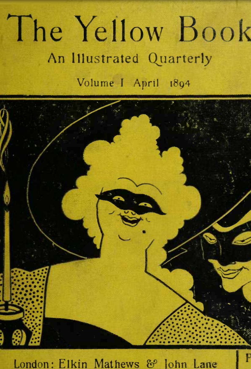
The Yellow Book was a short-lived illustrated quarterly journal of literature and art, published between 1894–1897. The bright yellow color of its cover recalls the look of racy French novels of the day, which were similarly bound (Wilde xx). It was also the color of avant-garde literature, and edgy books of all types (Doran 3). Priced at five shillings, it was comparatively cheap, as well, costing less than a new volume of fiction (Brooker and Thacker 78). Fig. 4 shows the cover of the first issue.
Holbrook Jackson describes its impact thus: “Nothing like The Yellow Book had been seen before. It was newness in excelsis: novelty naked and unashamed. People were puzzled and shocked and delighted, and yellow became the colour of the hour, the symbol of the time-spirit. It was associated with all that was bizarre and queer in art and life, with all that was outrageously modern” (Jackson 54).
Its inaugural issue began with a sketch by the pre-Raphaelite painter Frederich Leighton, the Henry James story “The Death of the Lion,” which parodies literary canonization, and an essay by Max Beerbohm titled “A Defense of Cosmetics.” Beerbohm’s essay begins: “it is useless to protest. Artifice must queen it once more in the town” (Beardsley 65). The “artifice” he exhalts is that of cosmetics, or the cosmetic, more generally. The epoch, as he sees it, is changing, and this has a distinctly visual effect: “For behold! The Victorian era comes to its end and the day of sancta simplicitas is quite ended. The old signs are here and the portents to warn the seer of life that we are ripe for a new epoch of artifice. Are not the men rattling the dice-box and ladies dipping their fingers in the rouge-pots?” (Beardsley 65). Rouge, of course, is the cosmetic product, usually worn on the lips and face, and which takes its name from the French word for red. It is usually reddish in color, but not always. It would not have been fashionable for Victorian women, apart from actresses, to use rouge, since, as one historian of cosmetics put it: “women of the [Victorian era] had to disguise any attempts at self-improvement. The prudery of contemporary moral standards was totally prohibitive as far as female vanity was concerned …” (Gunn 137). But this was starting to change by the 1890s.
For Beerbohm, and many other contributors to The Yellow Book, modernity meant bright colors: yellow books, yellow paintings, and red lipstick. “The era of rouge is upon us,” he wrote. “The good combinations of line and colour are nearly numberless … No monotony will be” (Beardsley 78).
The Yellow Book was, depending on who you talk to, either a Victorian precursor to the modernist little magazine, or one of its first exemplars. Either way, there’s no question that “the boom in yellow” became a boom in all colors, shortly after the ’90s came to a close.
Materialities of Color at the Turn of the century
Much of what explains the explosion of color, at the end of the nineteenth century, was material: the development of industrial pigments. There were simply more colors available in everyday life. Clothes could be dyed much more cheaply, using synthetic dyes; so could commercial products of all sorts. Paints, interior and exterior, could be made which were brighter, longer-lasting, and representing a wider spectrum. Advances in color printing techniques, such chromolithography and chromo-photo-lithography, made publications much brighter than before. As Blaszczyk and Spiekermann put it in their monograph of commercial color, Bright Modernity: “the mills that produced silk, cotton, wool, and rayon fabrics for use in ladies’ dresses and men’s suits relished brilliant hues that did not fade in the sun and blacks that were truly black. Retail shops created eye-catching window displays using electric lights and brightly colored fabric backdrops to attract window shoppers after dark” (Blaszczyk and Spiekermann 2).
We owe the expansion of color words in part to the industrial
revolution, and to the marketing of textiles and other goods with
colors. One famous example is that of mauve, a very rare word
until around 1860, when the dye mauvine began to be used commercially
(“Mauve, Adj.”). Previously,
one of the most expensive pigments worldwide was Tyrian Purple
(#66023C),
and clothes dyed with it were associated with royalty, who were usually
the only ones who could afford it. (Although the hue could be
approximated from mixtures of other dyes, it would never be as brilliant
or as long-lasting as when it was made from its traditional source: a
sercretion from rare sea snails.) That changed in 1856, when William
Henry Perkin accidentally synthesized from coal tar a substance he would
call mauveine, the first aniline dye (Finlay 354). While this may seem like a
footnote in industrial chemistry, Perkin was hailed as a folk-hero: upon
his arrival in New York, the New York Herald ran an article
with the headline: “Coal Tar Wizard, Just Arrived in Country, Transmuted
Liquid Dross to Gold” (Garfield 4). Once mauvine entered mass
production, the color mauve took on such popularity that the
1860s were termed the mauve
decade.Strangely, this is not the mauve decade in
America, as Thomas Beer terms it in the literary-social history The
Mauve Decade, which chiefly deals with the 1890s (Beer).
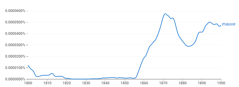
The color word mauve tracks the popularity of the dye. A Google Ngrams search of the English Fiction corpus for mauve, shown in fig. 5 shows a dramatic increase of the word’s frequency after 1860. After 1870, however, the word (as, presumably, the color) falls into disfavor from which it won’t recover until the twentieth century.
Incidentally, the data journalist Ben Blatt, in a book of computational literary text analysis descriptively titled Nabokov’s Favorite Word is Mauve has identified mauve as Vladimir Nabokov’s most frequent “cinnamon word,” that is, the word in his writing which is statistically much higher than it is in the Corpus of Historical American English (Blatt 170). Blatt suggests that this may have something to do with the Russian-born novelist’s synesthesia: in his autobiography Speak, Memory, he sees “projected, as it were, upon the inside of the eyelid … a mauve remoteness melting beyond moving masts” (Quoted in Blatt 170).
Mauveine soon paved the way for the synthesis of other aniline pigments, derived from coal tar. Notably, fuchsine was invented that same year, the substance to which we owe the color term fuchsia. Like mauve, both fuchsia (#ED0DD9) and mauve (#AE7181) refer to flowers with the same names (mauve is French for mallow), and so while the words appear earlier than 1856 in the OED, according to Google Books data, the words are almost never used as colors. In fact, their primary definitions refer to color of the aniline dye, specifically (“Mauve, Adj.”). The words mauve and fuchsia describe not just colors, but artificial colors, as does Beerbohm’s rouge. The number of artificial dyes would grow from fewer than 50, in 1870, to 1300, by 1913 (Blaszczyk and Spiekermann 3).
With this explosion in the availability of pigments came a need to name all the new colors, and to construct a scientific language of color which could be used to ensure color consistency in industry. Thus the genre of color manual was invented. They were used by naturalists, in need of describing the colors of new species; by philatelists, in need of describing the color of their stamps, and by manufacturers, who needed to keep a consistent look across disconnected factories. They were also used by educators, most famously by American educational reformers Milton Bradley and Albert Munsell, who developed systems of color education which were inspired by researchers such as Elizabeth Peabody and Friedrich Froebel, the inventor of kindergarten. Bradley and Munsell saw the need to standardize color nomenclature for childhood education, and so published books of color samples which could be used as universal referents. It is these books, we shall see in the section on heuristic color maps below, which I will use as inputs to train a model of literary imagination.
First, however, we must fully understand the problems presented by modeling visuality, by closely examining color language in two modernist exemplars: Virginia Wool’fs To The Lighthouse and James Joyce’s A Portrait of the Artist as a Young Man.
Case Study: Colors in To the Lighthouse
The works of Virginia Woolf make an exemplary case-study for a analysis of color words, not only because Woolf wrote so eloquently in her prose about the brightening colors of her generation, as I discuss above, or even that her works rank among the highest in terms of raw color proportions, as we will see in the results below in table 6, but because her fiction is remarkably painterly: at times impressionistic, at times cubistic, but always deeply visual. In Woolf’s own term, as I will explain below, it is all eye.
Since the Bloomsbury Group was so strongly intermedial—its members not only writers, but artists, theorists, biographers, critics, curators, and more—a tremendous amount has been written about the interplay between these people and their respective media. Jane Goldman’s The Feminist Aesthetics of Virginia Woolf reads Virginia Woolf’s aesthetic practices through her feminism, especially where it concerns post-impressionism. Goldman discusses the Woolfian moment which seems to stretch time, as in Bergson’s durée, such that sensory perception is heightened, colors brightened (Goldman). Claudia Olk’s Virginia Woolf and the Aesthetics of Vision takes a more philosophical approach, studying vision as “a significant semantic and structuring principle of Woolf’s novels as well as one of their organising paradoxes,” and putting Woolf into dialogue with writing on vision from Plato, Heidegger, and others (Olk 17). The Multiple Muses of Virginia Woolf collects a range of essays, connecting Woolf with Proust, Fry, 1920s cinema, Russian ballet, and music; and Virginia Woolf’s Bloomsbury collects essays on aesthetic theories within the Bloomsbury group (D. Gillespie; Potts). Maggie Humm’s Modernist Women and Visual Cultures examines Virginia Woolf and Vanessa Bell’s relations with photography and cinema, and publishes many family photos taken by the sisters (Humm). Jack Stewart’s Color, Space, and Creativity, cited earlier, is an analysis of the work of five British writers, the first of which is Woolf (Jack Stewart 25). His analysis hinges on cataloguing symbolisms of sorts: “various reds form a masculine complex consisting of Mr. Ramsay’s red-hot pokers, red geraniums, and reddish brown hedge; the reddish brown stocking that Mrs. Ramsay knits for the lighthouse keeper’s son; he image of James in judge’s robes; Paul Rayley’s blaze of amorous passion; and Charles Tansley’s red raucousness” (Jack Stewart 28).
The relationship between Woolf and her sister has been long discussed, as well. Both artists, a writer and a painter, they are at once a classic case of sibling rivalry, as well as a reification of the sister arts of painting and writing. Much has been made of the way they would spend time together, with Virginia writing or reading, and Vanessa painting. Or, how they would respond to one another’s work, with Woolf writing prefaces to Bell’s exhibition catalogs, and Bell designing covers for Woolf’s books. Diane Gillespie’s The Sisters’ Arts deals with just this: the sisters’ collaborations, critiques, and “dual creativities” (D. F. Gillespie). Jane Dunn’s A Very Close Conspiracy takes a more biographical approach to the sisters’ symbiosis (Dunn). And at least two novels have been written which fictionalize their relationship (Parmar; Sellers).
But what I would like to focus on, just by way of introducing this case-study, are the ocular and chromato-phenomenological aspects of Woolf’s aesthetics. That her work is all eye is not just my metaphor. She often wrestles with the interplay of vision and text in her own prose writing. For instance, color is the central topic of conversation in her 1934 prose work, Walter Sickert: a Conversation. The slim volume of only 28 pages begins at a dinner party, where one of Woolf’s guests claims that “in the eyes of the motorist,” “red is not a color but simply a danger signal” (Woolf, Walter Sickert 5). Another guest adds that, due to the increasing proliferation of colored signals, “we shall very soon lose our sense of color.” As the conversation evolves, they discuss many of the aspects of color I discuss in this chapter:
…how different people see colour differently; how painters are affected by their place of birth, whether in the blue South or the grey North; how colour blazes, unrelated to any object, in the eyes of children; how politicians and business men are blind, days spend in an office leading to atrophy of the eye; and so, by contrast, to those insects, said still to be found in the primeval forests of South America, in whom the eye is so developed that they are all eye, the body a tuft of feather, serving merely to connect the two great chambers of vision. (Woolf, Walter Sickert 7)
Woolf juxtaposes the pragmatism of “politicians and business men” with children and insects: beings for whom the sense of sight, and the sensation of color, are greatly magnified. This reminds another guest of a recent outing to see paintings by the British post-impressionist Walter Sickert:
…When I first went into Sickert’s show, said one of the diners, I became completely and solely an insect—all eye. I flew from colour to colour, from red to blue, from yellow to green. Colours went spirally through my body lighting a flare as if a rocket fell through the night and lit up greens and browns, grass and trees, and there in the grass a white bird. Colour warmed, thrilled, chafed, burnt, soothed, fed and finally exhausted me." (Woolf, Walter Sickert 9)
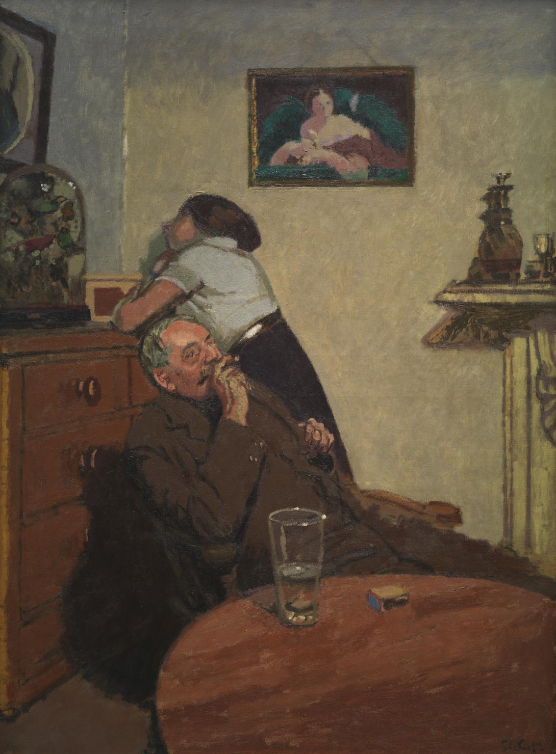
Many of Sickert’s works contain exceptionally bright colors, straight from the tube, they often seem. His choice of subject matter often tells a story, not unlike those of a novelist. Like Edward Hopper, and other painters of the decades to follow, the luminosities of his paintings contrast sharply with a subject matter that can portray deep loneliness, ennui, regret, or other subtle forms of discontent. In fact, these are often the titles of his paintings: see his Ennui (1913) in fig. 6, Despair (1908), or What Shall We Do for the Rent?.
Woolf’s dinner guests therefore describe him as a “biographer,” painting portraits-as-biography, or a novelist (Woolf, Walter Sickert 13). But the important question, for them, is “to what school of novelists does he belong?” (Woolf, Walter Sickert 17). “He is a realist,” one answers, “… nearer to Dickens than to Meredith. He has something in common with Balzac, Gissing and the earlier Arnold Bennett” (Woolf, Walter Sickert 17). The conversation describes paintings as if they were prose, and prose as if they were paintings—if not synaesthetically, then at least intermedially. One guest remembers reading a letter from Sickert in which he says “I have always been a literary painter, thank goodness, like all the decent painters” (Woolf, Walter Sickert 26).
But again, image-in-prose is never as simple as the Horatian ut pictura poesis. Color in text and speech always derives its effect through collocations, recollections, and other associations. As one dinner guest puts it:
[Sickert] must often think that to describe a scene is the worst way to show it. It must be done with one word, or with one word in skilful contrast with another. For example, there is Shakespeare’s ‘Dear as the ruddy drops that visit this sad heart.’ Does not ‘ruddy’ shine out partly because ‘sad’ comes after it; does not ‘sad’ convey to us a double sense of the gloom of the mind and the dullness of colour? They both speak at once, striking two notes to make one chord, stimulating the eye of the mind and of the body. (Woolf, Walter Sickert 22–23)
This guest compares this to the bright colors of a petticoat and chest of drawers: “…when, for example, we said that Rose’s red petticoat satisfied us; … Why did the red petticoat, the yellow chest of drawers, make us feel something that had nothing to do with the story? We could not say; we could not express in words the effect of those combinations of line and color” (Woolf, Walter Sickert 25).
These inexpressible color-sensations, what philosophers might call
inverted
qualia(See, for example, Byrne; ).
, are features of Woolf’s fiction, as well as her
nonfiction. To the Lighthouse is a perfect text for examining
the role of color in literature, since not only is it very colorful, but
deals explicitly with color perception. This is a novel that treats raw
color perception, and raw sensation—as opposed to conventionally
linguistic color writing—as transformative.
On one of the first pages, we hear Mrs. Ramsay muse that “any turn in the wheel of sensation has the power to crystallise and transfix the moment upon which its gloom or radiance rests” (Woolf, To the Lighthouse 3). On the one hand, as a novel that deals with an artist and painting, this is an extreme example of the phenomenon I’m outlining in this chapter, but on the other, this is also the best example. Let’s start with how the novel treats painting, and its relation to its subject:
Mrs. Ramsay could not help exclaiming, "Oh, how beautiful!" For the great plateful of blue water was before her; the hoary Lighthouse, distant, austere, in the midst; and on the right, as far as the eye could see, fading and falling, in soft low pleats, the green sand dunes with the wild flowing grasses on them, which always seemed to be running away into some moon country, uninhabited of men.
That was the view, she said, stopping, growing greyer-eyed, that her husband loved.
She paused a moment. But now, she said, artists had come here. There indeed, only a few paces off, stood one of them, in Panama hat and yellow boots, seriously, softly, absorbedly, for all that he was watched by ten little boys, with an air of profound contentment on his round red face gazing, and then, when he had gazed, dipping; imbuing the tip of his brush in some soft mound of green or pink. Since Mr. Paunceforte had been there, three years before, all the pictures were like that, she said, green and grey, with lemon- coloured sailing-boats, and pink women on the beach.
There are many phenomena of note in this colorful passage. Although we are not in painter Lily Briscoe’s mind, in this descriptive narration, we nonetheless see this scene painted with many simple, primary colors: unmixed colors, straight from the tube. First, the water is so flat, or so blue, as to resemble a plate. Then, the green grasses, and the implied sand-color of the dunes. So far, this seems like a stereotypical seaside landscape. But even though this is a tableau, constructed precisely to resemble a painting, it is not at all static: the dunes are “fading and falling,” the grasses are “flowing,” and “running away.” Both the lighthouse and the grasses are anthropomorphized, to some degree. It is only when the painter Mr. Paunceforte approaches it that it is reduced to simple “grey,” “lemon-colour,” and “pink”: subdued, secondary colors. These are the colors against which Lily Briscoe rebels, in her own painting of these scenes. Here is Lily’s free indirect discourse:
In contrast to Mr. Paunceforte, who paints to create a pleasant, “elegant” painting, Lily pledges fidelity to the bright violet of the jacmanna, and thus to her own perception of the color, no matter how inelegant it might seem. We see these same colors appear moments earlier, when Lily, “with all her senses quickened as they were,” was “looking, straining, till the colour of the wall and the jacmanna beyond burnt into her eyes.” Lily is so devoted to faithfully conveying the color of this scene that she has allowed her eyes to unfocus, and her vision to blur, impressionistically, which softens the edges of the scene, and reduces it to just its colors.
Here again, textual colors are the vectors along which visual
associations take place: transitions from one thought to the next. They
enact a persistence of vision in prose. When Mrs. Ramsay imagines her
son “all red and ermine on the
Bench,”The court dress of Lord Justice Clerks, among other
judges, is red and ermine.
that color is repeated in, or prompted by, the
reddish-brown stockings that she knits for her son, only a paragraph
later. Woolf suggests, then, through this chromatic association, that
she knits him these stockings as an unconscious way of preparing him for
a future career that she imagines for him. But the key is that she
imagines him red, not his clothes, suggesting that this color
impressionistically overtakes the image. It is a blur, a composite
image, as in a dream.
When we examine the incidence of colors along the narrative time of the novel, as in fig. 7 with the x-axis representing ten sections from the novel’s beginning to its end, we see an overview of its narrative-descriptive arc.
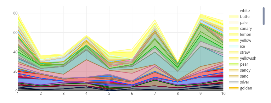
The parts of the novel with the most color are undoubtedly the beginning and the end. But a close contender is the middle section 7, which, as readers of this novel have no doubt already guessed, aligns perfectly with the “Time Passes” section. This is a strikingly poetic segment of the novel, full of abstract language, nature imagery, and few people. As in poems, and poetic description, time is allowed to run wild: narrative, plot, and character become subservient to vision and perception. Again, although these images at times painting-like perceptions, they are extremely dynamic, as if a film is being played at four times its recorded speed.
The novel ends just as colorfully as it started, and with an appropriate image. Lily Briscoe finishes her painting, and looks at her canvas: “it was blurred,” we are told. Finally, Lily says, “I have had my vision.” Vision, as I have argued in the introduction to this dissertation, is a curious word, since it is almost always used metaphorically. The times we encounter a phrase like 20/20 vision in literature of this period are far outnumbered by the times we see vision used in the sense of imagination, prediction, plan, or clairvoyance, as in, for instance, Yeats’s A Vision, or H.D.’s Notes on Thought and Vision (Yeats et al.; Doolittle). These are all, paradoxically, modes of thinking, or of intuition, that don’t involve actual sight. But yet the superficial meaning of this term is that of seeing. This is more than a chance ambiguity, but a testament to the discourse between visual experience and thought.
Case Study: Colors in A Portrait of the Artist as a Young Man
Another canonical modernist work with an abundance of textual color is James Joyce’s autobiographical bildungsroman, A Portrait of the Artist as a Young Man. Portraits are a genre of painting that are mimetic by definition: they aim to represent the image of their subjects. But the portraits of modernist Bildungsromane, however autobiographical, are impressionistic, representing instead the unfiltered worlds of sensory impressions, in order to mimic the visual experience of children, who have not yet mastered pragmatic lexical categorizations of their visual worlds. Bildungsromane often mirror this developmental phenomenology: being novels of education, they usually proceed chronologically, beginning with youth, and often from the viewpoint of youth. Joyce’s A Portrait of the Artist as a Young Man is the classic example of this narrative style.
Compared to Woolf and To the Lighthouse, Portrait has comparatively little critical writing which addresses his use of colors. Although a few studies directly address the use of color in Portrait. John O’Sullivan’s monograph Joyce’s Use of Colors chiefly deals with Finnegans Wake and Ulysses, but in it, he comments that “the color patterns of A Portrait of the Artist as a Young Man are most associated with the ambiguities present in the novel, especially with the confusion and misunderstandings of the protagonist” (Sullivan 23). Yutong Xie’s article “Color as Metaphor” examines Joyce’s use of black and green in Dubliners and Portrait (Xie).
Elizabeth Switaj’s James Joyce’s Teaching Life and Methods reads Portrait through Joyce’s pedagogical practices, and has a chapter on Portrait (Switaj). Switaj explains the color terminology used in Portrait through the lens of the Berlitz method, from which Joyce was teaching, in his day-job as an English teacher. In Method for Teaching Modern Languages, for example, the Berlitz Textbook he used, colors are on the very first page of instructional material. “Colours:” it reads, “red, blue, yellow, green, black, white, gray, brown. The pencil is green, the book is blue, the ruler is yellow, the necktie is red, the boot is black, the coat is gray, the hat is brown” (Berlitz 18). (Note: orange and violet are conspicuously absent. What would one of Joyce’s students have said, had they been looking at an orange book, or a purple coat?) Switaj argues that Stephen’s vocabulary of color words, like much of the rest of his vocabulary, follows the vocabulary of the Berlitz textbook (Switaj 52).
David Kastan, a professor of English who collaborates with a visual artist in the treatise On Color, begins with the first page of Portrait, however, the page of which features young Stephen’s refracted sensory impressions (Kastan 2). Kastan notes that young Stephen’s observation that “you could not have a green rose” is predicated on the aphorism that “roses are red.”
The first page of Portrait is what Derek Attridge calls “one of the most revolutionary pages in the history of fiction” (Attridge). Among them is his lisped, misremembered version of his father’s apparent bowdlerization of H.S. Thompson’s song, “Lily Dale”:
On the little green place.
He sang that song. That was his song.
O, the geen wothe botheth. (Joyce, Portrait 5)
Steven’s father, Simon Dedalus, substitutes “place” for what is in Thompson’s song, “grave,” presumably to make the song friendlier to his son. The song’s chorus actually reads:
Now the wild rose blossoms
O’er her little green grave,
’Neath the trees in the flow’ry vale. (Gifford, Joyce Annotated 133).
This mistake is the first of many parapraxes which will become hallmarks of Joyce’s style. Young Stephen’s refraction, “o, the geen wothe botheth,” which makes the rose green, rather than the grave or place, appears several pages later, when an older Stephen muses in the classroom at Clongowes, where the class has been divided into white and red rose factions, an imitation of the English War of the Roses.
Green roses are of course possible with artificial coloring, as with green carnations, Wilde’s aestheticist symbol that I’ve discussed above. This has led some to suggest that the “wild” of the “wild rose” may be a pun for “Wilde” (Valente 251).
But in the geopolitical climate of Ireland of 1916—the year Portrait was published, and the year of the Easter Rising—green roses are hardly aesthetic-as-apolitical, that is, art-for-art’s-sake. Just as white and red roses symbolized the warring houses of Lancaster and York, green was a nationalist color for Irish homerule and independence. So when H. G. Wells’s 1917 review of Portrait celebrates the novel for its “too true” “account of the political atmosphere in which a number of brilliant Irishman have grown up,” an atmosphere he diagnoses as “just hate, a cant cultivated to the pitch of monomania,” his epithet for these young Irishmen is “bright-green”: colored by nationalism, but also naive, inexperienced (Wells, “James Joyce” 88).
Katherine Mullin notes that the heightened sensory detail of young Stephen’s narration “shows the interior thoughts of a character expressed in the language he might use at the time his thoughts are occurring,” a technique she identifies as “coloured narrative” (Mullin). The term is Graham Hough’s, from a 1970 essay on Jane Austen, and refers to a narrative mode akin to free indirect discourse (Hough 205). The color of the term is meant metaphorically, and does not refer to literal colors, but is nonetheless an apt metaphor for Stephen’s colorful prose: his narration is not only colored by his personality, as Hough hears in the narrative of Emma, but by the visual qualities of his heightened perception.
Portrait, in its colored narrative, exhibits the modernist struggle with subjectivity through color, the locus of a great problem with knowledge and objectivity.
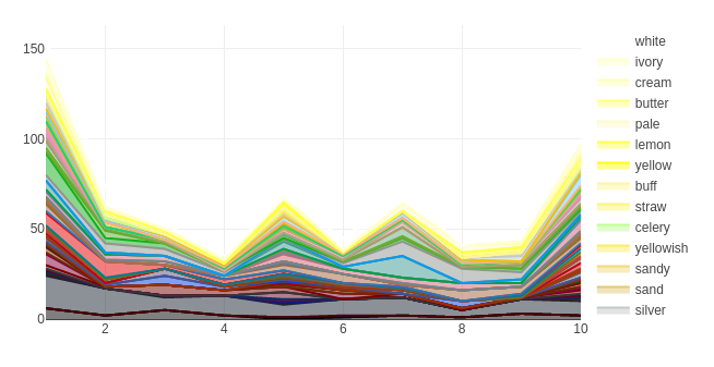
Fig. 8 shows the proportions of color in Portrait, plotted in narrative time. There are four main areas of color concentration here. The beginning, where Stephen is young and full of strong sense-impressions, exhibits the highest concentration. The next is at the halfway point of the novel (point 5). This is a segment from Father Arnall’s hell sermon, a winding, verbose speech about the horrors of hell, here annotated with \(CM_X\):
This segment is notable, not because it uses traditionally-recognizable abstract color words, like red, green, blue, and so on, but because it is colorful for its imaginable nouns: sand (#e2ca76), earth (#a2653e), forest (#0b5509), ocean (#017b92), sky (#82cafc), and sea (#3c9992), for example. It is no coincidence that Father Arnall repeats, three times, his instruction for his young listeners to imagine.
The next peak in colors comes at 60% of the novel, where an older Stephen, an aspiring poet, wonders what it is that attracts him to words. He reads one of his lines, “a day of dappled seaborne clouds,” and all of a sudden, “the phrase and the day and the scene harmonized in a chord” (Joyce, Portrait 146). Stephen thinks:
But Stephen soon negates himself: it is not the colors of words, or color words, that enchants him:
No, it was not their colours: it was the poise and balance of the period itself. Did he then love the rhythmic rise and fall of words better than their associations of legend and colour? Or was it that, being as weak of sight as he was shy of mind, he drew less pleasure from the reflection of the glowing sensible world through the prism of a language many-coloured and richly storied than from the contemplation of an inner world of individual emotions mirrored perfectly in a lucid supple periodic prose? He passed from the trembling bridge on to firm land again.
He never answers this question, which seems to linger on “the
trembling bridge” of language, a bridge which spans, on the one hand,
vision, imagination, and color: the concrete, the plastic; and on the
other hand, linguistic music: the sounds and rhythms of words. Stephen’s
phrase, “a day of dappled seaborne clouds,” is not just an image,
containing cloud and sea, and recalling the “dappled things” for which
Gerard Manley Hopkins praises God in “Pied
Beauty,”Although written in 1877, this poem would not be
published until 1918, making it too late to have been an influence for
Joyce. Had Hopkins live a little longer, or had Joyce been born a little
later, they surely would have met: a Jesuit, Hopkins taught at
University College Dublin, which Jesuit-educated Joyce attended.
but music: four alliterative iambs.
Like Woolf, and so many other modernist writers, Joyce describes literary language using chromatic metaphors, because color, in text, is evocative of mental images. The “sensible world” “reflects” through the “prism” of language, a device which, as Newton demonstrated, splits its input into a spectrum. This prism is that of imagination: the writer’s, and the reader’s: a mental image is split through the prism of language into its constituent colors, and then reconstituted in the mind of the reader.
The jump in textual color at the end of Portrait reflects the colorful descriptions in Stephen’s journal entries, which conclude the novel. Here is one entry:
Here we have many of the properties of textual color converging. As I’ve discussed above, textual color tends to correlate with high emotions: ecstasy, love, rapture (“O life!”). And color words are color exceptions: they describe things which are visually unusual, or striking: such is the mood of springtime. The first days of spring—in Ireland, at least—are full of new colors: where there had been gray skies and bare trees, there are now brightly-colored apple flowers. People leave their houses to spend time outdoors, “romping.” Stephen stares at the girls, notices their hair, and imagines them blushing (because of something he said?). As Sinclair wrote of Richardson, “it is as if no other writers had ever used their senses so purely.”
Color Epistemology
Before we can discuss the modeling of color information, we must first consider some of the problems with color, with color words, and with the connections between the two. Consider the color term lemon-yellow. A metaphor derived from a natural object, it ostensibly suggests a color which is the yellow of lemons. Unlike abstract colors like red or blue, there is a natural referent to which we all can turn if we want a common understanding of a color. But lemons, as a farmer might explain, are only yellow during a short window of their existence. To further complicate matters, even ripe lemons at a grocery store vary considerably between batches, individuals, and levels of freshness. But at the same time, lemon-yellow is not strictly a Platonic ideal to which all lemons, or paintings of lemons, aspire, either. Instead, the term describes a color phenomenon somewhere between lemons, our memory of them, our visual experience of them, and what we read about them. This semantic slipperiness is a problem to which I’ll return often in this chapter, since it represents what I see as one of the central concerns of modernist literature: gaps in the phenomenology of visual experience, between the writer’s visual experience, the text as written, and the reader’s imagination.
Aloys Maerz and Morris Paul’s 1930 reference manual A Dictionary of Color, one of the inputs to the model I’ll make below, acknowledges this problem as one they hope to solve with their manual. They see this as a part of the “material” and “intellectual” confusions of color names:
The confused ideas on color nomenclature are found due to two factors, one material, the other intellectual. The first has been the ability of color makers, in the past, to produce color substances that were both brilliant and permanent … the second is the difference of opinion as to the exact color indicated by any name, and the lack of any authority by which an individual opinion can be upheld. … the name Lemon Yellow would seem sufficiently accurate as a descriptive term, yet the color of lemons varies slightly and the memory for exact color sensations, when the original is not at hand, is often faulty. (Maerz and Paul 1)
Readers of James Joyce’s Ulysses may remember the color lemon-yellow, and lemons themselves, as leitmotive that appear at intervals in the novel. First appearing in the Telemachus episode as the “Paris fad” for tea which Buck Mulligan rejects in favor of “Sandycove milk” (Stephen has just recently returned from Paris, and had aquired some of its habits), the color appears in “Proteus,” as Stephen muses about the effects of sunlight on the color of the houses: “Gold light on sea, on sand, on boulders. The sun is there, the slender trees, the lemon houses. Paris rawly waking, crude sunlight on her lemon streets” (Joyce, Ulysses 10, 35). Neither the Sandymount houses nor the Paris cobblestones are painted lemon-yellow, of course, or appear so at all other times of day, but they look this way under the reflection of the early morning light. Stephen, a poet, is more interested in the phenomenology of the visual experience than its lexicon—one which would describe the houses by the name of their paint, or the stones as gray. Lemon-yellow, then, is the site at which the Aristotelian conception of color–that the stones are gray—meets Newtonian color phenomenology—that they appear gray.
Leopold Bloom, too, the hero of Ulysses, imagines the skin of his naked body in the bath, as “lemonyellow,” not because he is jaundiced, or of olive-toned Mediterranean complexion, but because he imagines the light catching his body, “oiled by scented melting soap,” the lemon-scented and lemon-colored soap he’d just bought (Joyce, Ulysses 71). When Bloom later notices the scent of “citronlemon” in his handkerchief, he conflates the citron, an ancestor of the lemon and the French word for lemon, with Israel Citron, a real Dubliner about whom he had been thinking two paragraphs earlier (Gifford, Ulysses Annotated 74, 133). Don Gifford suggests that Bloom “associates the soap with the citron (Ethrog) central in the ritual of the Jewish Feast of Tabernacles (Sukkoth)” (Gifford, Ulysses Annotated 133). In the surreal dream of the Circe episode, this soap appears reified an a sun-god, “diffusing light and perfume.” and speaks in terms of light and reflections: “we’re a capital couple are Bloom and I. He brightens the earth. I polish the sky” (Joyce, Ulysses 340). For Bloom, colors like lemonyellow are a phenomenological crucible where visual experience and olfactory memories are melted together.
But not only are these textual perceptions problematic, but, as Maerz and Paul remind us, the color of lemons themselves varies. In fact, lemons themselves are green before they ripen, and green in certain varieties. In French, a language in which Stephen often daydreams, lemons and limes are citrons and citrons verts, (“green lemons”) most commonly, meaning that lemons can be both yellow and green, in that language’s taxonomy. However, the color lemon, in English and in French, invariably refers to a bright yellow, despite any variation in its actual color. This is a theoretical problem now, but will become a practical problem, in the section below, on modeling color categorization. Everyone knows that lemons are yellow, blood is red, and the sea is blue. But lemons are also green, blood is usually brownish, and the sea may appear purple, brown, or green. So description, then, is both a representation and a social contract.
This fact is one of several properties of color words which complicate the algorithmic design below in the experimental design section, and which bear discussion, as they inform the way we must treat color words, going forward. Three problems in particular deserve attention. The first is that color terminology is perceptually uneven. The second is that colors are indistinguishable from their object-archetypes. And the third is that color descriptions are color exceptions: they describe aberrant color phenomena. Let’s examine each of these in turn.
Perceptual Unevenness: On the Impossibility of a Bluish Yellow
An even more troubling, and more deeply epistemological problem, Ludwig Wittgenstein articulates in his late work Remarks on Color. He asks, quite simply, whether it is possible to imagine a “bluish yellow”:
If you call green an intermediary colour between blue and yellow, then you must also be able to say, for example, what a slightly bluish yellow is, or an only somewhat yellowish blue. And to me these expressions don’t mean anything at all. But mightn’t they mean something to someone else? (Wittgenstein and Anscombe 20e)
Wittgenstein then asks whether a “reddish green” or other color
combinations might be difficult to imagine, and why. He posits that the
category of green is what prevents him from imagining “bluish yellow,”
since, he says, “for me, green is one special way-station on the
coloured path from blue to yellow…” (Wittgenstein
and Anscombe 22e). This is an important question, with many
implications. First, what colors are there which have greater primacy
among speakers of English? And more generally: why do linguistic
categories—color words and their weights in our language—transform our
imaginative
processes?I say “our” here with some hesitation, since I suppose
an affinity with others who might experience color terminology in the
same way, but recognize that a painter, with years of experience mixing
colors, might imagine these terms differently, as would, most likely, a
speaker of a language very different from English. Still differently
would a blind person imagine these colors.
Saija Kerttula calls this the derivational productivity of a
color word, and lists a number of ways that a color term may be derived
(Kerttula
89). Adding -ish is one, but there is also
-ied, as in rubied, -y as in bluey,
-ate as in roseate, off- as in
off-white, and many others. For the sake of simplicity,
however, let’s stick with the most common, -ish, and attempt to
test this question of Wittgenstein’s, by examining patterns in literary
data. To test this, I constructed a matrix of color expressions from the
\(CM_X\) color
map,Described in more detail in the
\(CM_X\) section below.
where one word ends in -ish. The resulting
matrix is shown here in fig. 9.
Not only are there no entries for bluish yellow or reddish green here, but a few other patterns are apparent. First, yellowish green is not mapped to the same color as greenish yellow, indicating that the order of the adjectives dictates precedence. Second, those colors that take -ish adjectives are common colors. However common a color like maroon might be, reddish maroon does not appear in this list, potentially because it’s not considered a basic color with the ability to be mixed. However, some colors which are common in marketing, like beige and teal, but which are less common in paint names, are present here.
Also note that orangeish and orangish, variant spellings of the word, have different average colors here, and orangish is used as a modifier half as much as orange is modified by an -ish. We might say, that orange can -ish, but it is not very -ishable. Greenish and brownish are much more versatile as modifiers than others: they are good -ishers. But green is much more easily -ished than other colors. So does green take a first place in our cognitive pantheon, despite being a secondary color?
Pink has many variations here, despite being simply a shade of red. We don’t see these same patterns with an analog of pink in other hues, like light blue or light green. This leads one to believe that pink’s monolexemic and monosyllabic advantage over analogues like light blue give it more cognitive-categorical weight.
The unevenness of these compound color words reflects similar patterns with visual perception. As early as 1892, the psychologist of color vision, Ewald Hering proposed what he called opponent-process color theory to describe the primacy of certain color categories, and their mutual exclusion (Turner 130). Hering’s theory posits opponent color pairs black-white, green-red, and blue-yellow. The activation of one color cancels its pair. This theory not only helps to explain certain types of color-blindness, but a number of other experimental observations, such as after-images. The competing theory of trichromacy, put forth by Thomas Young and Hermann von Helmholtz in the mid- to late-nineteenth century, posits that color perception is owed to three retinal receptors with different, but overlapping, frequency sensitivities: a red, a green, and a blue. The current understanding of color perception borrows from both of these nineteenth century theories, but acknowledges that color perception is even more complex than these theories would suggest. To some degree, these theories are baked into the equations which the CIE uses to describe perception, as in eq. 3, which I use in my algorithmic design below.
Colors are Intertwined with their Object-Archetypes
Objects and their colors define each other. In a metaphoric sense, objects are colors: we use things to describe our visual experience. Alternatively, our color categories are shaped by the kinds of things we often see which are seemingly illuminated by these colors. The sky is blue is a statement of such obvious fact that the phrase has come to emblematize obvious facts themselves. The sky is blue, leaves are green, roses are red, and violets are blue. Or are they violet?
Put differently: are violets named such because they are violet in color, or is the color word violet the name for the color of the flower? Lexical data from the OED show that violet the color appears at least a hundred years after violet the name of the flower—in 1430 and in 1330, respectively (“Violet, Adj.”). We already know this about mauve. Similarly, we might ask, which came first, the color orange or the orange fruit itself? And there, too, the name of the fruit, taken from the name of its tree, is ultimately descended from Sanskrit, and is older than English itself, but the color sense only appears in the early 16th century (“Orange, Adj.”). So we might deduce that the polysemy between these colors and their associated objects is caused by the phenomenon of naming colors after common objects.
But not all color words are metaphors, of course, and in other cases, the relations between a color and its typical objects is much more complex. A look at some frequently-occurring bigrams shows a kind of magnetism between objects and their appearance. Kerttula calls this a color’s referentiality, or application (Kerttula 87). Some color words we expect to see describing certain objects, and certain objects recall their common color descriptors.
To measure this, I designed the experiment below, in order to find
out what objects are most often described as blue,
red, and so on. I wanted to quantify the gravitational pull of
colors with their associated objects. I use data
from the Google Books Ngram Viewer project, hereafter \(C_{NG}\) (Google Books Ngram Viewer
Exports). Google Books provides n-gram (sequences of
words of length \(n\)) data for the
books in its vast collection, and the most recent version, 20200217,
provides n-grams tagged according to their parts of speech. I use the
data subset English Fiction, which, although not strictly relegated to
the time and place this I am studying here, is still useful to determine
broad
patterns.I describe this corpus in greater detail in the
appendix.
There, I query for patterns ADJ NOUN, where
ADJ is a color word, tagged as an adjective, and NOUN
is any noun which follows. The list of color words I derive from Berlin
and Kay, but augment with several auxiliary color words, for comparison
(Berlin and
Kay).
Fig. 10 shows word cloud
visualizations for each color word and its most commonly collocated
nouns.Word clouds, or tag clouds, are a relatively recently
popularized technique of textual data visualization, which depicts the
frequency of words through typeface sizes. See Viégas and Wattenberg for a
history of the visualization that traces it to Soviet
Constructivism.
Surprisingly, the most frequent collocations are not
always the most cliché: green grass and green leaves
are of course present, but are not as frequent as green eyes.
Blue sky is present, and red blood, but are
subordinate to hair and eyes.

Some overall trends are apparent in these words, which may be
illuminated by categorizing them. Using WordNet, the relational lexical
database, I am able to identify hypernyms for most of these words, and
group the words according to these hypernyms (Miller). The hypernym treemap for red,
for instance, shown in fig. 11, shows
that a good proportion of the words are body parts (they have the
hypernym synset body_part.n.01), or “coverings” such as
hair (covering.n.01). A crucial similarity between these
bodily descriptors, from red hair, the most frequent
collocation, to red eyes, red lips, and red
face, is that they describe exceptions, or aberrations, from their
usual states. Red hair (actually orange, as I will show) is
among the least common natural hair colors. Red eyes describe
diseased or depigmentized eyes, of humans or other animals. And red
lips are lips that are unusually red: whether blood-filled through
vigor, or excitement, or through the use of cosmetics.
Artificial objects comprise a second, equally large, hypernym, artifact.n.01. These are, with a few exceptions like brick, items which have been dyed red: silk, velvet, dress, shirt, tape, lipstick, carpet. If silk, or a dress, were always red, we might not need to describe it as such—it would be obvious. But since these are all items which are typically dyed, at least in modernity, they need to be described according to their dye. As with the red body parts above, the dye here is the difference, or the abnormality, which necessitates the color description.
This leads me to a theory of color description: that color descriptions are color exceptions.
Color descriptions are color exceptions
We are blind to things that aren’t important to us, or exceptional in some way. It’s not that the light, at certain color frequencies, doesn’t reach our eyes, but it isn’t processed by our brains in the same way. Thus, what we describe, using color words and color expressions, is what we have noticed, or what we want to be noticed: something different, striking, or unusual. This is why red hair is a more frequent collocation than black hair or brown hair, despite the rarity of the gene that causes red hair.
At this point, you may fairly imagine a number of counterexamples, not the least of which are those clichés I’ve just outlined: the blue sky, or the even wine-dark sea. I would argue that, in most cases, these are a special kind of exception: one of magnitude, rather than category. In other words, when a writer describes leaves as green, it is less often a pure cliché than a calculated underscoring of the visuality of the leaves: that they are unusually green, noticeably green, or a particular subcategory of green.
To illustrate this phenomenon, here is a passage from Jacob’s Room, Virginia Woolf’s novel, which, incidentally, I will later show is among the most colorful in this period of British literature:
The tree had fallen, though it was a windless night, and the lantern, stood upon the ground, had lit up the still green leaves and the dead beech leaves. It was a dry place. (Woolf, Jacob’s Room 21)
Here, green leaves describes an exception to the rule in
which living leaves are green, and dead leaves are brown. But this
theory remains manifest upon closer examination of some of the bigrams
of fig. 10 as they appear in \(C_{PG}\).A full
concordance is available here.
There, the phrase green leaves is rarely
unaccompanied by an additional modifier. Leaves are light
green, emerald-green, or sea-green: specificities
that take color knowledge, via visual abberation, into the realm of
color description.
As another example, in James Joyce’s 1914 short story collection Dubliners, the boy protagonist of “An Encounter” describes trees along the canal bridge: “all the branches of the tall trees which lined the mall were gay with little light green leaves and the sunlight slanted through them on to the water” (Joyce, Dubliners). The leaves are light green—they’re described with a level of specificity calculated to produce a mental image.
Similarly, in John Galsworthy’s The Dark Flower—a colorful novel, as it narrates the life of a visual artist—we read of “a blue sky thinly veiled from them by the crinkled brown-green leaves” (Galsworthy 66). Sometimes the word-order is different, even though the same syntactic dependence remains: in May Sinclair’s Mary Olivier, a Life, one of the most colorful novels as measured in the analysis below, we see “green leaves” which “had the cold glitter of wet, pointed metal” (Sinclair 107). Here is another very colorful passage from the same novel, again annotated with its color words from \(CM_X\):
The sun shone. The polished green blades of the grass glittered. The gravel walk and the nasturtium bed together made a broad orange blaze. Specks like glass sparked in the hot grey earth. On the grey flagstone the red poppy you picked yesterday was a black thread, a purple stain.
She was happy sitting on the grass, drawing the fine, sharp blades between her fingers, sniffing the smell of the mignonette that tingled like sweet pepper, opening and shutting the yellow mouths of the snap-dragon.
Sinclair is not content with a description which presents leaves as green, but instead, presents them with alien qualities. These leaves appear so unusually, she implies, that the play of light on their surfaces appears as if their material were entirely different. Other leaves are present here: nasturtiums (a bright orange flower), here compared to the orange of a flame, and a red poppy. But Sinclair points out that the withered red poppy is no longer red, as its name suggests. Setting aside the symbolism (in 1919, red poppies could not have been mentioned without calling to mind the poppies of John McCrae’s war poem, “In Flanders Fields”), the poppy in question, although taxonomically red, is in fact black and purple.
It may seem as if this argument—that color descriptions are visual anomalies—deflates upon scrutiny. After all, it’s obvious that we don’t need to say the obvious. But this theory will be born out materially as we begin to reverse-engineer textual imagination, which we will now see.
Experimental Design: Modeling Imagination
I arrive at the literary-historical trends in textual color, shown in fig. 1, and the more granular findings described below, through a complex process of modeling visual information. This process is not just a technical detail, I must reiterate, but is coextensive with my arguments about modernist literature, since it highlights many of the problems with visual description with which modernism continually wrestles.
In summary, the process involves a machine-learning model, originally designed to detect named entities (names, organizations, products, and so on), which has been taught to recognize colors words, complex color expressions, visual descriptions, and things or situations that evoke color. Since it must be fed a huge amount of training data, I provide several word-color maps, which store relations between color expressions like fuchsia rose and #C74375, the hexadecimal representation of the color in RGB (red, green, blue) space. These maps are combined and weighted according to their individual strengths and weaknesses. I conduct the training using a quasi-supervised, or human-in-the-loop method, in which the model asks me to decide about edge-cases for which it has low confidence. I answer, the model is improved, and the process continues. Ultimately I create a model which imagines a wide category of objects, abstractions, verbs, and adjectives.
The first issue in the design of the algorithm is the task of mapping a word to a color. That is, given a word like blue, the program should be able to imagine #0000FF, or another blue. But this task is not as easy as it seems at first.
I began with a seemingly simple problem: what color words should I look for in texts? Should it only imagine basic colors, like red, green, and blue, or should it also include crimson, cerulean, mauve, and so on? Is black a color? What about brown? It turns out that there are many lists of what could be termed “basic” colors.
One might start, for instance, with the chromatic colors, that is, the colors of the rainbow. But even those are of unknown quantity. Aristotle insists that the rainbow has only three colors: red, green, and violet. The appearance of other colors, he argues, is just an optical illusion caused by the interference of the first three. Here he is in Meterologica:
The rainbow appears with three colours; this is true of each of the two, but in a contrary way. The outer band of the primary rainbow is red: for the largest band reflects most sight to the sun, and the outer band is largest. The middle band and the third go on the same principle. So if the principles were laid down about the appearance of colours are true the rainbow necessarily has three colours, and these three and no others. The appearance of yellow is due to contrast, for the red is whitened by its juxtaposition with green. (Ross and Smith 374–75)
Anyone with an Anglophone primary school education would likely read this argument of Aristotle’s with rage and indignance: everyone knows that rainbows have seven colors: red, orange, yellow, green, blue, indigo, and violet. But isn’t indigo just a shade of blue? And isn’t green just a “waystation” between yellow and blue, in Wittgenstein’s term? Our color categories, and their number, largely is derived from the work of Isaac Newton. In his Opticks of 1730, Newton experiments with prisms, and creates an artificial rainbow, which he describes as having seven colors: red, orange, yellow, green, blue, indigo, and violet. One might fairly ask whether indigo is so distinct from blue that it requires its own category. And, in fact, this skepticism would be reflected in the word frequencies: indigo is about two hundred times as infrequent, in literature, as blue, so as a lexical category, it is much less salient. But Newton chose the number of colors to be seven, in order to correspond with the seven notes of the western musical scale (Kerttula 18). Still, even after naming these, he admits that there are, in reality, many more than seven:
In the Experiments of the fourth Proposition of the first Part of this first Book, when I had separated the heterogeneous Rays from one another, the Spectrum pt formed by the separated Rays, did in the Progress from its End p, on which the most refrangible Rays fell, unto its other End t, on which the least rafrangible Rays fell, appear tinged with this Series of Colours, violet, indigo, blue, green, yellow, orange, red, together with all their intermediate Degrees in a continual Succession perpetually varying. So that there appeared as many Degrees of Colours, as there were forts of Rays differing in Refrangibility. (Newton and Innys 106)
Newton’s qualification wouldn’t stop this list of seven becoming the canonical list for generations of schoolchildren in the Anglophone world, who would often learn it as the name of a man with a mnemonic acronym for a name: Roy G. Biv. The honorable Mr. Biv, now a household name, features in the titles of at least a dozen books, for children and adults. Had Newton left out indigo, schoolchildren today would likely learn a different mnemonic. Had Newton been Hungarian, there likely would have been another red in the rainbow, and had he been Russian, there might have been another blue hyponym to add to his existing two. Had he been Vietnamese, green and blue would have been the same color, as they are in Aristotle. I’ll spend more time explaining these multilingual color variations below, but for the moment, we can say that these color categories are anything but stable: the rainbow is a spectrum, and we could divide it however we want. Crucially, those divisions come from language, rather than vice-versa: our linguistic categories for color determine how we see the world’s colors.
So perhaps, then, the colors of the rainbow would not even be a good starting-point for a color list. Instead, I turned to bigger lists: color names from contemporary paint manufacturers and designers, historical color manuals from the late nineteenth and early twentieth centuries, and even color names crowdsourced from participants in twenty-first century color surveys. Yet each has it own problems, as we’ll see below. Thus, I outline several criteria for what we would need in a color/word mapping:
- Consensus. Color names should not be too subjective, since we want language that can be evocative with some degree of reliability. To this end, word/color pairs that appear in more than one map should be weighted higher than those that only appear in one.
- Synchronicity. The color names should not be anachronistic to the texts we are trying to understand. So a color like cyberspace blue is not very relevant to an understanding of a Virginia Woolf novel. However there is a remote sense in which it is: the imagination of a contemporary reader applies to his or her understanding of a literary work.
- Syntopicity. Army green and navy blue refer to the uniforms of their respective countries. So a color map from the UK would be very different from a US color map, in these respects. Consider also post box red, which would depend on the colors that post boxes typically have, in one’s country.
- Objectivity. We need to mitigate the influence of marketing on color
naming. Paint manufacturers and similar organizations have a way of
describing colors that are meant to sell paint: they skew towards
pleasant color names. Yet not all colors are pleasant
ones.However, colors on the whole do skew towards pleasant
ones. Since colors are only perceptible in one’s central vision, and not
peripheral vision, color perception betrays attention.
- Size. It would be best not to exclude colors simply because they don’t appear in a pack of Crayola crayons. Yet the more colors one includes, the more chances there are of metaphors that are more subjective, and farther afield.
A related issue is the algorithm by which we collapse color word orthographies:
- Fuzziness. Blue-green and blue green should be categorized together as the same color. Yet blue! Green, that is, at the end of one sentence and the beginning of another, should not be categorized together.
- Absinthe green should match absinthe as well as absinthe green.
- Green and greenness should be in the same family, but not necessarily as synonyms, since greenness connotes something more abstract.
With these principles in mind, I choose several books, and several databases containing color/word mappings, and combined them into one master map. I will occasionally use individual databases where appropriate, but the deep imaginer I train below is trained on this master mapping.
Heuristic Maps
The breadth of the text/color translation problem is suggested even in at a glance at its bibliography: dictionaries of color, or manuals of color nomenclature, were essential reference books for centuries, not only among visual artists, designers, and others that work with pigment, but among botanists, ornithologists, philatelists, and anyone else in need of a standardized way to describe visual phenomena. These manuals invariably contained color plates—some hand-painted, even—intended to be concrete mappings between color words and their associated hues. I chose just a few of these, based on their proximity to the period, the availability of their electronic editions, and/or the number of colors they contained. I denote each \(CM\), for color map.
\(CM_R\), Ridgway
Some of the most ambitious attempts at mapping colors to their names, or naming colors, came from the natural sciences. American ornithologist Robert Ridgway (1850-1929), for example, authored two influential works of color naming systems: A Nomenclature of Colors for Naturalists in 1886, and Color Standards and Color Nomenclature in 1912 (Ridgway, A Nomenclature of Colors for Naturalists; Ridgway, Color Standards and Color Nomenclature). In the preface of the earlier work, Ridgway names as his problem that “the author has in collection considerably over three hundred water-colors, each bearing a different name” (Ridgway, A Nomenclature of Colors for Naturalists X). This volume contains over a thousand colors, although the color names are less metaphorical (lemon-yellow), and more descriptive (bright yellow).
To extract the colors from this book, I create a method whereby I
extract images from the digitized pages of the book, computationally
crop color swatches from the pages, and compute the dominant color of
each
swatch.The code for extracting material from \(CM_R\) may be found here
in this project’s repository.
Fig. 12 shows a page from
the latter book, from which I extracted this data.
As seen here, Ridgway’s scientific approach to color description, which prefers regular pale, buff, deep, and dusky variations of colors, sacrifices the specificity we find in other color manuals for a system which aligns colors into a matrix. Often a row in one of Ridgway’s plates will contain colors that all have the light modifier, or the dusky modifier. Ridgway himself apologizes for this:
The selection of appropriate names for the colors depicted on the Plates has been in some cases a matter of considerable difficulty. With regard to certain ones it may appear that the names adopted are not entirely satisfactory; but, to forestall such criticism, it may be explained that the purpose of these Plates is not to show the color of the particular objects or substances which the names suggest, but to provide appropriate, or at least approximately appropriate, names for the colors which it has seemed desirable to represent. (Ridgway, Color Standards and Color Nomenclature 10)
For this reason, I assign a lower weight to these colors, but include them to increase the breadth of the master color word mapping.
\(CM_S\), Saccardo
A continental work of the same decade is the ambitious and polyglot
volume from Italian botanist Pier Andrea Saccardo bearing the formidable
Latin title, Chromotaxia Seu Nomenclator Colorum, Polyglottus,
Additis Specimibus Coloratis ad Usam Botanicorum et Zoologorum
(1894) (Saccardo). Although containing only
fifty colors, it features an index of several hundred “synonyms” for
these colors in Latin, Italian, French, English, and German. While some
of these are recognizable to modern Anglophone readers, others seem
strangely specific, such as Murinus (mousey) or
Fuligineus (“sooty”). Saccardo provides two supplementary
colors: achrous, or colorless, glassy; and sordidus,
or “sordid,” “dirty,” which he describes as a modifier rather than a
color.
“non est color definitus sed indicat inquinamentum
aliorum colorum. Exempla: sordide albus, luride ruber” (Saccardo
16).
Saccardo’s decision to write in Latin seems to affect his color nomenclature: since abstractions are less stable, and less translatable across languages (see the discussion below on color terms in the linguistic relativity debate), his taxonomy prefers lemmas with metaphorical origins: fumosus or smoky, rather than, griseus, or gray; sanguineus or blood-colored alongside ruber or red.
As with Ridgway, I parse the color swatches included in digitized editions of this book, normalize the colors, and extract the dominant color of each swatch. Then, using his thesaurus, I associate each color with its English synonyms. This contributes a number of new colors: eye-blue and eye-grey (from cæsius); egg-yellow (from luteus), and livid from lividus. I assign these colors the same weights as those in Ridgway.
\(CM_M\), Maerz and Paul
Maerz and Paul’s 1930 A Dictionary of Color provides the largest number of colors, and was itself meticulously compiled from a number of prior manuals. This volume claims to contain “the most extensive range of colors as yet published, together with a list of practically all recorded color names in use up to this time in the English language” (Maerz and Paul v). The dictionary contains over three thousand colors.
Maerz and Paul recognize that there is a wide gulf between those of their source materials produced for naturalists, like those of Saccardo and Ridgway, and those produced for marketing purposes, that is, to sell pigments or the commercial products they color. They lament that “our present language of color is, to a certain extent, composed of words that are somewhat meaningless in themselves as color terms. This refers to words such as ‘folly,’ ‘Westminster,’ and ‘elephant’s breath’; they are lacking entirely in descriptive color value, yet their continued use earns them a place among the accepted color names that custom has decreed should compose our vocabulary” (Maerz and Paul v).
I am inclined to disagree somewhat: if I were to guess, I’d imagine “elephant’s breath,” despite breath itself being achromatic, to be close to the gray of elephants, and “Westminster” to be a grayish, brickish color, like that used in the eponymous Abbey of London. Folly is harder to imagine, but it likely wouldn’t be a subdued beige.
I assign an identical weight to \(CM_M\) as I do the manuals of Saccardo and Ridgway.
\(CM_P\) Pantone
The Pantone set, one of the most common among designers and artists today, contains over two thousand colors, although the colors have names which are much more commercially-based than others. Thus, these are biased towards food-related words, flower-related words, or anything else that would seem like a pleasant marketing term. Bridal blush (#eee2dd) and bridal rose (#d69fa2) seem marketed towards wedding decorations; and margarita (#b5c38e), martini olive (#716a4d) towards the cocktail set. The list is also remarkably upper-class in flavor. Ski patrol (#bb1237) and billowing sail (#d8e7e7) represent leisure-class sports, while spa blue (#d3dedf), stretch limo (#2b2c30) (why not just limo?), and caviar recall other activities associated with the wealthy. The logic must be: who wouldn’t pay a little extra for an article of clothing with a color like caviar, instead of just dark gray?
To find these trends more systematically, I vectorized their color
names with GloVe vectors, and then clustered them using the K-means
clustering technique, using six
clusters.(Glove vectors are described
in Pennington et al.; ; see Jain for a historical overview and summary of
K-means.)
The categories here are very human-legible. Categories
0-3 are natural metaphors of various sorts (flora, fauna, landscape
features). Category 4 is mostly varieties of white, as well as other
light colors. Category 5 is colors derived from food.
Category 0: gardenia #f1e8df, dew #eeded1, ecru #f3dfca, delicacy #f5e3e2, icicle #dadcd0, twill #a79b82,
Category 1: white-asparagus #e1dbc8, vanilla-ice #f0eada, cloud-cream #e6ddc5, vanilla-custard #f3e0be,
Category 2: turtledove #ded7c8, papyrus #f5edd6, seedpearl #e6dac4, sandshell #d8ccbb, navajo #efdcc3,
Category 3: egret #f3ece0, pristine #f2e8da, birch #ddd5c7, angora #dfd1bb, fog #d0c5b1, ice #e0e4d9, frost
Category 4: snow-white #f2f0eb, bright-white #f4f5f0, cloud-dancer #f0eee9, blanc-de-blanc #e7e9e7,
Category 5: marshmallow #f0eee4, vanilla #f4e1c1, rutabaga #ecddbe, tapioca #dccdbc, parchment #dfd1be,
I derive this color map from a web-scraped dataset, itself derived from Pantone’s own website, but assign half the weight of the previous manuals (Pantone). This dataset nicely balances the scientific modes of the previous ones, yet is still highly subjective. Still, I include it in order to train the imagination algorithm to imagine more concrete color metaphor. Now, it may be able to imagine moonbeam (#696156) and skyway (#adbed3).
\(CM_X\), XKCD
The antidote to the Pantone set is one from Russell Monroe, an American author, former NASA engineer, and cartoonist best known for his webcomic XKCD. Monroe surveyed his wide readership, asking them to name colors they were shown at random on his website. He also took demographic data from them, logged their locations via their computers’ addresses, and asked them whether they were colorblind, or used a CRT (cathode ray tube) monitor. The survey results, which represent five million color mappings from 220,500 users, show a consensus for many color names. A sample of these is shown in table 1.
| Color Name | RGB Hex Value |
|---|---|
| purply blue | #661aee |
| silver | #c5c9c7 |
| sickly green | #94b21c |
| melon | #ff7855 |
| mocha | #9d7651 |
| coffee | #a6814c |
| canary yellow | #fffe40 |
| purpleish | #98568d |
| bluey purple | #6241c7 |
This mapping presents a useful counterpoint to commercial mappings
such as that of Pantone, or to more systematic mappings like Ridgway’s.
In the sample presented in fig. ¿fig:xkcdBlocks?, we
see a mix of naming metaphors. The usual food metaphors (melon,
mocha, coffee) appear next to animal metaphors
(camel, canary yellow) and creative compounds
indicating a small amount of one color mixed into another (purplish,
bluey, purply, preyish). The informality of the “-ish” suffix
suggests extemporaneous description, as if colors are mixing in the
imaginations of these survey respondants, in the absence of a ready-made
metaphor. For comparison, greyish pink in this color map is
blush in Pantone, and darkish green translates to
online lime. And of course, one would expect that sickly
green would not be an easily marketable name for a commodity,
especially if it were food, so in Pantone the color is lime
green.If an exact match for a hex value does not exist in a
color map, I find the closest color to it using \(\Delta E^{*}_{ab}-76\). This is described
in more detail in the section on categorization below.
There are some issues with this mapping, however. One is that, since this is crowdsourced data, it relies on the crowd’s spelling abilities, and virtually no one, according to Monroe, spelled fuchsia correctly (“Color Survey Results”).
Summary and Comparison
I assign weights to colors in each of these mappings as follows:
| Abbreviation | Name | # Color/Word Pairs | Year | Weight |
|---|---|---|---|---|
| \(CM_S\) | Saccardo, Chromotaxia Seu Nomenclator Colorum | 500 | 1894 | 2 |
| \(CM_R\) | Ridgway, Color Standards and Color Nomenclature | 1113 | 1912 | 2 |
| \(CM_M\) | Maerz and Paul, Dictionary of Color | 3224 | 1930 | 2 |
| \(CM_P\) | Pantone Colors | 2310 | 2010 | 1 |
| \(CM_X\) | XKCD Color Survey | 954 | 2012 | 3 |
To compare the tendencies, or biases, of these color maps, and to better know how to balance them, I calculate the average of their 300-dimensional GloVe vectors (Stanford’s Global vectors for word representation, trained on English-language websites), and derived the cosine similarity to the vectors of a number of seed words, shown in [eq. 1]:
\[similarity(\vec{A}, \vec{B}) = \frac{ \vec{A} \cdot \vec{B} }{\|\vec{A}\| \times \| \vec{B} \|}\qquad{(1)}\]
Or, the dot product of the two vectors, normalized by the product of their two \(L_2\) (Euclidean) norms.
Fig. 14 shows a series of word vectors chosen to illustrate the vector similarity with the average vectors of each color map. \(CM_P\), the Pantone map, has a higher similarity to positive, marketable-sounding words, and words evoking leisure, whereas \(CM_X\) has a higher similarity for snot, a decidedly unmarketable word, discussed later, and Jaffer’s aggregation of \(CM_S\), \(CM_R\), and \(CM_M\) shows a slightly higher similarity for blood, also not a decidedly marketable term.
Given these tendencies, I weight these color maps as described in table 2, and combine them into one large master color mapping, which will become the basis of the imagination model below.
The resulting color map, \(CM_A\) (A, for all), is the combination of the above maps. This color map is then fed into the deep imaginer, as described below.
Deep Imagination: Probabilistic Color Inference
Mapping color expressions to RGB hexadecimals is only the beginning. Since explicit color words are not the only words that suggest color in the mind of the reader, and since broadly imagining a text will allow us to understand it more than narrowly, I design a way for this program to imagine those more abstract words and phrases. But this is non-trivial problem. First, how can we derive the color of an object, or an adjective, where that color is known to a human reader, but not to a computer? For example, the words Statue of Liberty would recall the pale greenish color of copper oxide to those familiar with the statue, even from images, although this mapping isn’t readily available in a database. Similarly, if a poet or novelist presents us with imagery which is all of a single color, we want to be able to see that. One of the tasks of a literary critic, after all, is to be sensitive to the arrangements of the writer, so as to point out their resonances.
Take, for example, Katherine Mansfield’s 1922 story “The Garden Party,” an inspiration for Woolf’s Mrs Dalloway, and a classic modernist short story. (The short story collection of the same name is among the most colorful works, as measured in the analysis below.) Set on a fine day in early summer, in New Zealand, it is resplendent in greenery, which is to say, flora. But besides the grass, the lawn, the green bushes, the karaka-trees, and the leaves and stems of the flowers, there is an unusual abundance of other green things, as well. Laura’s sister Meg is wearing a “green turban” when she arrives for breakfast (Mansfield 287). A band plays music from a tennis court, which we might assume is green, since it’s compared to a pond, and tennis courts are usually green. The band itself are wearing green, which makes Kitty compare them to frogs (294). Green baize doors separate the servants’ rooms from the rest of the house (289). Some of this is explicitly labeled as green, but some, like frogs and tennis courts, we are just expected to know are green things. While frog green does appear in one of the color mappings above, and tennis court green appears in some responses of the original \(CM_X\) survey, the value does not appear in the final mapping. So to computationally imagine not just green itself, but things which are very likely to appear green, we need to find a way to imagine colors from any semantic lexeme. This is where we must develop an engine to model deep imagination.
The deep imaginer will be taught to recognize color expressions based on the heuristic maps above, as a first step, but should also be taught new techniques for color inference. These techniques are: collocation-based inference, which uses the proximity of words to color words; dictionary-based inference, which uses dictionary definitions, and image-based inference, which uses stock images downloaded from the Internet.
Collocation-based Inference, \(M_P\)
One of the simplest methods of color inference is to calculate the syntactic distance from a known color word to a target word. Given a large enough corpus, it is quite likely that, for example, green will appear within several words of grass, and so by measuring the distances from green to grass, and noticing that these distances are much shorter than for the pair red and grass, we might infer that grass is green: that is, the literary imagination of grass has the color category green.
Another example might be inferring the color of a gull. Anyone who has visited the north Atlantic shore knows that gulls tend to be white and gray. Of the 170 times that the word gull appears in \(C_{PG}\), we see white appear within about ten words of it nineteen times. The lemma grey appears six times. Red, however, appears not once. Of course, both green and yellow appear twice, although not with the same relations in the dependency graph. Given this collocation data, we can write a model that guesses that gull is mostly white, a little gray, and with hints of green and yellow.
However, syntactic proximity is preferable to raw proximity itself, and so I developed an algorithm to score relations between two neighboring words, which uses both linear word distances and syntactic distances. I calculate syntactic distances by traversing the dependency trees of their containing sentences. By way of illustration, take these lines from Arthur Conan Doyle’s 1908 novel Sir Nigel:
Next morning they found themselves in a dangerous rock studded sea with a small island upon their starboard quarter. It was girdled with high granite cliffs of a reddish hue, and slopes of bright green grassland lay above them. (Doyle 250)
The syntax dependency graph of the clause, “slopes of bright green grassland lay above them” is parsed as shown in fig. 15:
Here, bright and green are syntactic descendants of grassland. This might even more accurately be parsed with bright and green together as one semantic unit.
This model infers color associations \(W_C\) from target words, \(W_T\), by traversing the syntax tree, and calculating weights accordingly.
However, modifiers are not always direct descendants of their modified words, since they might cross sentences. (Imagine a passage that were to read: “The slopes of grassland. How bright green they were!”.) So to account for these types, I also compute weights based on the raw distances of these words from each other. The full algorithm is this:
- It begins by identifying a color word, \(W_C\) from color map \(CM_X\) in the target text.
- It then parses the containing sentence, and determines its syntactic dependencies.
- Starting from \(W_C\), it navigates through parent words and parent noun chunks \(W_T\) to the root of the sentence.
- If \(W_T\) is a noun or adjective, it is assigned a score: 2 if it is a direct parent of \(W_C\), or 1 if it is a grandparent of \(W_C\), at two steps’ removal in the syntactic tree.
- All other words nouns and adjectives are now candidate \(W_T\), and are assigned a score: \(1/i\) where \(i\) is the distance, in number of tokens, from \(W_C\). Thus, it gets a score of 1 if it is a directly adjacent word, or 0.5 if it is two tokens away.
- These scores are then averaged for each token that shares the same lemma.
The resulting data structure looks like fig. 16, for grass:
There are plenty of colors, like blue, which are uncommon for grass (except for the Appalachian style of music). Yet these other colors represent only a small proportion of that for green. I blend these colors together, by finding their hex values in \(CM_X\), and then averaging their RGB values, after weighting them, so given RGB values \(R_i ... R_j\), \(G_i\), and \(B_i\), and weights \(W_i\), averaging them proportionally:
\[blended RGB = \frac{ W \sum_{R_i}^{R_j} }{ \sum_{i}^{j} W } , \frac{ W \sum_{G_i}^{G_j} }{ \sum_{i}^{j} W} , \frac{ W \sum_{B_i}^{B_j} }{\sum_{i}^{j} W}\qquad{(2)}\]
Or, for all colors, weighting and summing each component of RGB space, and then dividing by the total sum of all weights. For grass above, we get #6b9c56, a pleasantly grassy color.
This model works reasonably well—that is, meets our modern English-speaking expectations of the archetypal colors of many nouns. But there are quite a few notable differences. One is the principle of color description exceptionalism I outline above: color descriptions are anomalies. Although sheep are typically white, and black sheep comparatively rare, the probability of encountering the phrase black sheep in British fiction is about five times greater than that of encountering white sheep, according to bigram data from \(C_{NG}\).
Fig. 17 shows a portion of the model’s inferences for sheep.
The blended color from \(CM_X\) is #5B5441, a dark greenish, and hardly the color one would expect of a sheep. Part of this is because, as you can see from the inferences above, \(CM_X\) contains many metaphoric colors like grass, heather, and stone. Although these are almost certainly not used as color words in their original contexts, this model counts them as colors. This is perhaps not a bug, however, but a feature of the program: by picking up on elements like stone and grass, we might fail to imagine the sheep itself, but we succeed in imagining the hue of its context, and in a sense, this is more information than we would get from simply imagining a sheep. And after all, when we ourselves imagine a sheep, we might very likely imagine it in its pastoral context, among grass and stones, rather than floating in a colorless void, away from everything else.
But the converse of that phenomenon is also present. We might not expect to see white and gray occur so often close to gull, because these are obvious descriptors, yet we do. When a writer wants to underscore the visual properties of an object that already has well-known color properties, this contributes to the impressionism of the piece: it allows the reader to see through the writer’s eyes.
This phenomenon is brilliantly at play in another Katherine Mansfield story, “Bliss,” written two years earlier in 1918. It is even more colorful than “The Garden Party,” and its colors much more variegated. This reflects the mood of its protagonist, Bertha, who is so happy that she is almost manic. Her attentions are everywhere, and glittering, reflecting off of everything.
There is a very particular quality of light in this story: it is not a categorical color, but a phenomenological one, describing not what Bertha knows the color to be, but how it seems. Bertha sees and feels bright sparks. The narrator tells us that “in her bosom there was still that bright glowing place—that shower of little sparks coming from it” (Mansfield 145). This moment is mirrored in a description of a fruit bowl which Mary at that moment brings in, and she perceives as “a glass bowl, and a blue dish, very lovely, with a strange sheen on it as though it had been dipped in milk.” Here, Mansfield contrasts the color category of the dish—it is blue—with its perceptual reality: it appears white.
Bertha sees the fruit in this bowl also with an acute sense of newness: not quite estrangement, in Shklovsky’s formulation, but a newly intimate familiarization. “There were tangerines and apples stained with strawberry pink. Some yellow pears, smooth as silk; some white grapes covered with a silver bloom and a bug cluster of purple ones. These last she had bought to tone in with the new dining-room carpet” (146).
“Apples stained with strawberry pink,” is an uncommon metaphor for apples, which \(M_P\) models as in fig. 18, and for which the blended color is #AC883B.
In other words, apples are usually golden, green, red, gold, or yellow, but rarely strawberry pink. (There is an apple cultivar called the “pink lady,” but it wasn’t cultivated until 1976.) As with milk, this is a food metaphor, one which uses these colors, as the foods themselves seem to do, as a marker for something delicious or desirable.
Grapes, too, typically belong to the categories red or
white, like their wine. Yet white grapes, and white wine, are
not white at all, but a pale
green.Anders Steinvall points this out, noting that the
white of white wine is an instance of type
modification (Steinvall, “Basic
Colour Terms and Type Modification” 57)
Red grapes and red wine are not red, either, but are
usually a deep purple. This illustrates the lemon-yellow
position I have outlined earlier: color designations are more a matter
of convention than faithful representation of the visual world.
Mansfield would have been aware of this quality of grapes, and has
Bertha call them “purple” to show that she is attune to the phenomenon
of their hue. Mansfield further highlights this by showing the chromatic
harmony Bertha expected, and sees, between the grapes and the
carpet.
So by modeling imagination in this way, we’re able to take advantage of the ways writers show us the perceptual experience of words, rather than just their semantic categories. But this model is only one component of a larger system.
Dictionary-based Inference, \(M_D\)
To short-circuit the problem of color exceptionalism, I mine color inference data from more straightforward definitions, like those found in dictionaries and encyclopedias. There, sheep are more likely to be described as white. Project Gutenberg provides a copy of Chambers’s Twentieth Century Dictionary of the English Language, published in London in 1908. If I did not already have color mappings for grass (\(CM_X\): grassy green, #419c03; grass, #5cac2d; grass green, #3f9b0b), we would find this entry for grassy: “covered with or resembling grass, green.” Since words and their definitions are regularly formatted in this dictionary, it becomes possible to parse the dictionary entry into word/definition pair, and load them into a lookup table. From there, I construct an graph, where nodes are dictionary words and their colors, and edges accrue weight each time a color word from the color maps appears in the definition of one of the defined words. Thus, if we see grassy appear on the left of the page, and green in its definition, we give it a score of one. If green were to appear twice in its definition, we’d give it a score of two, and so forth. I repeat this process with an encyclopedia: The Nuttall Encyclopædia, first published in London in 1900, and still in print by 1966. Other dictionary and encyclopedia-like works are available in the usual plain-text sources, but few meet the criteria of (a) British, (b) out-of-copyright, (c) in plain-text, and (d) in an easily parsable format.
This model does not seem to perform as well as \(M_P\), however. Here is an entry for grass, for example.
The model triangulates between the color word and entry/definition pairs, but only finds a few single instances each. Possibly as a happy coincidence, however, the resulting aggregate here is #89bc6e, a very grassy color.
When merging these models, I weight \(M_D\) the lowest, since with a lack of data (dictionaries), and an inconsistent level of descriptive detail, it’s less reliable.
Image-based: \(M_I\)
A third solution mitigates some of the problems described above, by escaping comparison between colors and objects, and looking to images as a source of color information. Given a database of images that are correctly labeled, it should be possible to extract color values from those images, and build a pipeline that infers a color given a word. Luckily, two somewhat newly-created web services provide such a database: Unsplash and Pexels are stores of open-licensed stock photos and illustrations, which provide open APIs (Application Programming Interfaces) which allow users to retrieve images based on a given keyword. This follows methods used by other projects that attempt to map words and colors (Guilbeault et al.).
However, an image of a given object, such as a sheep, rarely contains only sheep. There is almost always a background to the image which is of a different color. I try to control for this difficulty by disregarding the most frequent color of these images, and only working with the second and lesser frequent colors. From there, I average the resulting colors of all the images, to retrieve an imagined (inferred) hue for the lemma.
The resulting algorithm may be summarized as follows:
- Scan through the text, looking for nouns, adjectives, or similar words (words with potential visual content).
- For each matching word, find its lemma.
- Query the Pexels / Unsplash APIs, giving the lemma as a search term, and ask for ten image addresses. Download them.
- For each downloaded image, find the second to Nth most frequent color.
- Average all these colors proportionally, using the algorithm described above.
- Return a pairing of a word with a corresponding RGB hex value.
Fig. 19 is a sample of the model’s inferences for three fairly concrete words, wheat, butterfly, and tennis, and with three more abstract words, deposit, pure, and travelling. I’ve included a few images used in the creation of each color, to allow for some model introspection.
Wheat the model predicts reasonably well: the resulting color is a golden brown. Butterfly is more uncertain, in part because there are a very large number of butterfly species, and so there is an incredible diversity of color patterns between them. Tennis one might have expected to be more greenish, since most tennis courts are green. The averaged color here reflects the inclusion of the image where the court is red, and the image of the racket alone. Deposit is curious: probably because it would be a rare word to use to tag a photo, the first four images are likely from the same photographer and shoot. The last is an image of bars of gold, however. This is interesting, since it is not a stack of paper money, but of an archetypal idea of money—the gold standard—which is no longer in widespread use. The inferred color for pure, interestingly, is anything but—it is a dirty grayish. Even though most of these images are water-related, one is of honey. This seems to show one of the pitfalls of computationally imagining an abstract concept. Travelling, on the other hand, is a very distinct blue, owing to the color of the beach scenes that have become emblematic of travel today. Coincidentally, however, blue seas would have been a common feature of international travel in the early twentieth century.
A broader view of this model, shown in fig. 20, gives one a sense of a few trends. First, almost all of these colors are very desaturated: they appear as if they began as pure pigments, and were mixed with a titanium white. This is owing to the way each of these is by nature an average of several colors: they are mixed. At a glance, the legal-sounding words power and possession appear darkest. The two words dealing with negative emotion, rudeness and objection, appear redder than the others. And words that evoke comfort, reliance, liberty, and amusement, appear bluish. Neighbour and neighbourhood, meanwhile, appear green, probably owing to stock images that involve green lawns.
When projected in HSL space, certain patterns emerge, as well, as shown in fig. 21.
For the problems cited above, I weigh this model higher than \(M_D\) but still lower than \(M_P\). In the absence of an evaluation metric—and I doubt one is possible—I feel like our intuition as readers, and imaginers, is enough to evaluate and weigh these methods of imagining.
Comparison
| Model | Inference Basis | Weight |
|---|---|---|
| \(M_P\) | Literary Proximity | 1 |
| \(M_D\) | Dictionary Proximity | 0.6 |
| \(M_I\) | Image Aggregation | 0.8 |
I combine these three models according the weights given in table 3, and produce a master mapping I’m calling a deep imaginer. This I then integrate with the shallow color maps described above, cascading all the models together. This model I then use to train a named entity recognizer.
Training a Model for Named Entity Recognition
The Rose Problem
Early iterations of this engine found a staggering incidence of the color word rose in the literature of this period. It didn’t take much introspection to determine that this was not exclusively the color rose, but either a woman’s given name, Rose (my parser is case-insensitive), an equivalent surname, or the past tense of the verb rise. One could remove all tokens where the first letter is capitalized, but then that would also eliminate the color rose which appears at the beginning of a sentence. One could run a part-of-speech tagger over the text, and throw out all the verbs, but this only solves half the problem.
A method exists which, if properly extended, mitigates this problem. Named Entity Recognition, or NER, is a sub-field of natural language processing which computes the probability that a string of words is a named entity. Usually, these are people, places, organizations, languages, ethnicities, and so on, and detecting them has been useful in commercial applications of text analysis, where a corporation might be interested in finding all instances of Apple, the computer company, but ignore all instances of apple, the fruit.
NER has been practiced, in one form or another, since at least Lisa Rau’s 1991 paper, Extracting Company Names from Text (Rau). But whereas early techniques like Rau’s were heuristic, modern methods use computational neural networks to achieve this end. Among the most accurate NER engines now is Explosion AI’s SpaCy library, which uses residual convolutional neural networks along with specialized word embeddings to achieve reasonably accurate predictions of entities like personal names, organization names, as well as disambiguate numeric tokens into quantities, cardinal numbers, and so on (Honnibal).
NER becomes useful to my study in two ways: first, it allows me to discard those entities like “Rose,” (a given name), as well as “Mrs. Brown,” and “Mr. Green.” (Although there is a case to be made that the writer’s choices of these names, where they are fictional, are as deliberate as choice as a visual descriptor.) Second, since this general-purpose NER doesn’t detect color expressions, descriptions, or any literary features, I train it to do so.
I train two NER models, which I’ll use to detect text with visual properties: a shallow model, \(NER_S\), and a deep model \(NER_D\). The seed data set for the more restricted model, \(NER_S\), is trained on raw color entities from \(CM_X\), while that for \(NER_D\) is trained on the set of more general visual expressions spans generated from the deep imaginer.
The Beret Test
These are not the only training data sets I feed to the model, however. I use SpaCy’s Prodigy tool to dynamically correct the model’s most uncertain guesses, across a corpus of edge-cases. In training \(NER_S\), I aim for a more restricted definition of a color: one which may be parsed as a color without much context. For example, in the famous hook from the Prince song, “Raspberry Beret,” we understand that in the words “she wore a raspberry beret,” “raspberry” is the color of her beret, which is made of cloth, and not of one or more raspberries. But if we replace raspberry with a more uncommon color, say, electric, or cyberspace (color names from \(CM_P\)), it is not still clear that the word is a color description, and does not describe some other attribute.
The process of training this model was instructive. \(NER_S\) found instances of the word salmon often, and since the word appears in nearly every color map (e.g., \(CM_R\): #D9A6A9; \(CM_X\): #FF796C), it identifies any use of salmon, regardless of whether it refers to a color. It is important to note here that salmon, the color, refers to the color of salmon meat, rather than the color of the fish itself. In other words, the color refers to the inside of the fish, rather than the outside. Disambiguating between these two senses of the word is a non-trivial task for this model. Nonetheless, given a large number of training examples, the model is able to perform better than chance.
What we are left with, after training, are probabilistic models capable of identifying explicit color expressions, in the case of \(NER_S\), and anything that may be imagined, in the case of \(NER_D\). So, to employ Mansfield again, \(NER_S\) finds instances of green baize, and assigns it an RGB value, whereas \(NER_D\) finds instances of tennis lawn, and also assigns it a green value (following color inference, described below).
But first, we would need a way of categorizing the color values generated by these models. Much in the same way that a text analysis project needs a lemmatization system to group together words like sky and skies, go and went, we need a way to bring together variations, shades, and other common properties of colors.
Problems in Color Taxonomy
Color Spaces and Color Difference
We now move from discrete description of color to continuous—i.e., from that is blue to that is 80% blue. Now that we’ve mapped color words and other color-containing text to the model’s guesses of their mappings, we need a way to organize them, in relation to one another, and in relation to our perception of them. This is problematic, since we are dealing with two ontological domains: a linguistic domain, and an analogous psycho-physical. Furthermore, there are a multitude of ways to quantify color properties, and to organize colors by those properties.
Relations between colors—color difference—is a long-standing problem. Colors are typically categorized in relation to one another by embedding them in a color space: a vector space in which each color is a point in its coordinate system. These spaces are very precisely described in technical literature (Fairchild, for instance). The biggest problem they attempt to solve is that hues themselves, due to the anatomy of the eye, do not have linear relationships—this is why three-dimensional projections of these color spaces are often conical, or even asymmetrical. Furthermore, each color space must account for ocular physiology across individuals; differences in ambient reflectors, illuminants, and other lighting conditions; and differences in reference points (white values used as anchors for other color properties). We will not need all of these details, but a summary of these color spaces is necessary, since I will be using many of them below.
It is useful to pause for a moment, however, and consider that color spaces are themselves descriptions, in the literary sense, of color—they can approximate their object, but only asymptotically. And yet so much of our modern world is made up of these approximations. Every screen we use—including the one I’m using to type this now, and the one you’re using to read it—is composed of millions of tiny picture elements—pixels—each with three lights: a red, a green, and a blue. The more specific colors, and the images, that we see on these screens are only mixtures of those elements.
The most common color spaces in use today include RGB, which stands for red, green, and blue; CMYK, or cyan, magenta, yellow, and white; HSL, or hue, saturation, and luminosity; and CIELAB, the newest and most accurate of these spaces. RGB is most common among light-producing devices like computer monitors, and generates colors additively, by mixing red, green, and blue light. These values are often expressed in hexidecimal, with the marker #, such that #ff0000, red, indicates the highest value for red (ff), along with the lowest value for green (00), and the lowest value for blue (00). CMYK is the most common for print media, on the other hand, since it describes colors subtractively, combining cyan, magenta, and yellow. HSL is a useful derivative of RGB, meanwhile, which allows for numeric manipulation of colors according to these values of hue, saturation, and luminosity.
The current standard colorspace, CIE \(L^* a^* b^*\), usually abbreviated CIELAB, is a product of a century’s long effort by the Commission Internationale de l’Eclairage [International Commission on Illumination], or CIE, an organization formed in 1913 to solve problems of chromaticity standardization, among others. A 1973 meeting of the CIE Colorimetry Committee, having evaluated a number of previously used color difference formulae, produced the first iteration of the LAB colorspace, intended to model human color perception. Here, \(L^*\) represents luminosity, \(a^*\) represents a spectrum of hues between green and magenta, and \(b^*\) represents hues between blue and yellow (l’EClairage).
Relations between colors may then be calculated with respect to this coordinate system. The Euclidean distance between two colors in a LAB vector is therefore the square root of the differences of each of its components. The CIE calls this formula \(\Delta E\) (Robertson 167).
\[\Delta E = \sqrt{(\Delta L^*)^2 + (\Delta a^*)^2 + (\Delta b^*)^2}\qquad{(3)}\]
Since CIELAB space best represents human perception of color, I’ll
use it wherever possible, and calculate color distances using \(\Delta
E\).I implement this function here,
in the color categorization module of my color analyzer.
However, I have to translate frequently between LAB space
and RGB space, since most of the color maps I’ve derived, are either
scanned using digital photography, or, in the case of the XKCD map,
produced using computer monitors.
Debates in Color Categories and Nomenclature
If we aim to quantify the occurrences of certain color concepts, and not just the color words, then there must be a way to categorize visual experiences. For instance, if we encounter the expression light blue, we must be able to categorize this as a variety of blue, or else we will need to process and compare thousands of variables, instead of just a few. Yet the epistemological problems of the color/word interchange make this a difficult task. To begin with, since we are dealing with spectra, the boundaries of these categories are not well-defined. But the very existence of the categories themselves should not be assumed, either. While, to a painter or interior designer, the differences between ecru and eggshell may be crucial, these words may not be in the working vocabularies of some novelists. I say “working” here because they might be recognizable, and even familiar, to a writer, but they might not be the operative metaphors he or she chooses when describing a scene, or allowing a literary persona to describe it. So the color spectrum of a writer’s idiolect is always a subset of his or her dialect.
For instance, we might consider light blue to be a subcategory of blue, since the word blue is contained within it. However, is pink necessarily its own category, or is it simply a shade of red? And if so, is light pink a subcategory of pink or of red? We might categorize these colors differently if we were to use the hues rather than their written expressions.
We might look to other languages to see how these concepts are expressed, and learn about our own by comparison. Some languages lack a monolexemic term for pink, and others still have additional pink-like lexemes in other hue spectra. The Russian language, for instance, has the color-categories, or monolexemic color terms, синий [sínij], usually translated as “blue” or “dark blue,” and Голубо́й [golubój] which we might gloss as “light blue,” or “sky blue.” The image-based color mapping model, described below, predicts similar, but not identical colors for these English and Russian words, as well as their most common French translations:
| Russian | Ru.RGB | English | En.RGB | French | Fr.RGB |
|---|---|---|---|---|---|
| синий | #163B97 | blue | #1A5AB6 | bleu | #0C4397 |
| Голубо́ | #75A7CD | light blue | #83CFE8 | bleu claire | #8DC7D9 |
Semantically and chromatically, these color categories are not synonymous. Just in the way that every translation requires some compromise, some reshaping, colors do not always cleanly map across languages. Some do: English blue and French bleu, as etymological kin, are not only morphologically closer than the English/Russian pair, but semantically, as well, and the model predicts this kinship.
The differences in color terminology between languages are important for us to bear in mind, even when the primary analysis below deals only with texts in English, because these differences are analogues for the gaps, and communications, between language and vision. Furthermore, most of the writers I’ll be discussing here speak more than one language: either from birth, as with Conrad and his native Polish, or through study, as with James Joyce, who was fluent in at least five languages. And some experiments in psychology show semantic shifts in color categorization among speakers of more than one language (Ervin; Caskey-Sirmons and Hickerson; Athanasopoulos et al.).
More importantly, however, in order to categorize color words, we must first decide what our base color categories will be. This is no easy matter, and has long been the subject of debate. By comparing languages, linguists have often tried to ascertain what fundamental colors are, irrespective of their respective cultures.
One side of this debate calls into question the basis of fundamental colors, instead positing that color nomenclature, along with other phenomena, is in fact a cultural or linguistic construct. Probably the most well-known of these theories of linguistic relativism is that independently promoted, starting around the 1930s, by linguists Edward Sapir and Benjamin Whorf. Whorf’s 1940 summary of this view puts it succinctly: “the categories and types that we isolate from the world of phenomena we do not find there because they stare every observer in the face. On the contrary the world is presented in a kaleidoscopic flux of impressions which have to be organized in our minds. This means, largely, by the linguistic system in our minds” (Whorf 212).
On the other side of the debate, usually termed universalism, is an influential study of cross-linguistic color terminology, in a 1969 monograph of Brent Berlin and Paul Kay, Basic Color Terms: Their Universality and Evolution (Berlin and Kay 2). In particular, they name eleven categories: “white, black, red, green, yellow, blue, brown, purple, pink, orange, and grey,” and suggest that these categories develop in roughly that order—that all languages have words for white and black, that if they have a third, it is red, and so on. Graphically, Berlin and Kay present this sequence as in the following diagram, where languages that have red must have both white and black, and so on. There is no order between yellow and green, but languages that develop a word for green would then develop a word for yellow, and vice-versa.
\[[\substack{white \\ black }] < [red] < [\substack{green \\ yellow}] < [blue] < [brown] < [\substack{purple \\ pink \\ orange \\ grey}]\qquad{(4)}\]
Berlin and Kay see this sequence as a linguistic evolution in more than one sense—a dangerous term, in that it suggests a linear progression of simple to complex languages. The reasons they give for this are “increasing technological and cultural advancement” among the languages they compare. By way of explanation, they suppose that,
… to a group whose members have frequent occasion to contrast fine shades of leaf color and who possess no dyed fabrics, color-coded electrical wires, and so forth, it may not be worthwhile to rote-learn labels for gross perceptual discriminations such as green/blue, despite the psychophysical salience of such contrasts. (Berlin and Kay 16)
While the contrasts might have a physical basis, their linguistic categories do not map evenly to them, as Berlin and Kay themselves show. And as one might predicted, since 1969, their arguments of universal categories—and to a larger extent those of language evolution—have been either denounced as Anglocentric, or at least treated with a healthy skepticism. For instance, in 2006, Anna Wierzbicka argues that even the notion of color itself is not universal. Citing decades of research within the subfield of Natural Semantic Metalanguage, Wierzbicka argues that, “while many languages do not have a word for ‘colour,’ all languages have a word for seeing,’” and that “it makes more sense to ask about the universals of seeing rather than any putative ‘universals of colour’” (Wierzbicka 3).
I take no sides in this debate, but present it as evidence of the bond between language and perception. While there are few hard-line Whorfians remaining in linguistics, or universalists, both camps seem to agree that there are exceptions pulling at their theoretical sweaters, and colors are frequently the axis along which that pulling happens.
Is blood red?
To further complicate our conception of color/word translation, let’s return to the discussion of color word conventionality begun in the section on lemon-yellow above. As I have argued, although red is the conventional color of blood, blood itself is rarely red. This phenomenon presents itself in process of computational color categorization attempted here. While categorizing colors using CIELAB \(\Delta E\), which model human perception, I find that the category for the \(CM_X\) color word blood (#770001) gets categorized as brown, instead of red, as one might have predicted. Incidentally, blood red (#980002) is an entirely different color in the \(CM_X\), which is redder (i.e., contains a higher R value in its RGB representation) than blood. And dried blood (#4b0101) also exists, and is mapped to a darker red.
My initial feeling was that blood was miscategorized as a brown, and should instead be categorized as red. We all know blood is red–the term blood red itself proves it, right? But to look through images of blood, we may, in fact, discover that it is not red, but at best, a reddish brown. This is seemingly confirmed by the deep imaginer’s image-based imagined color (described below), which is #915b47. An image search at a stock photo provider like Unsplash or Pexels seems to confirm this, as well. However, crucially, the same searches for illustrations, rather than photos, depict blood as a bright red, instead of reddish brown—this seems to show that the linguistic-cognitive concept of blood is aligned with the concept of red, even though they aren’t visually equivalent. So when the OED editors, however meticulously they document the usages of blood-red, which date back to early Old English, gloss the term disappointingly literally as “red like blood; blood-coloured,” they do not account for the discrepancy between the color of “blood-red” and the actual color of blood (“Blood-Red, Adj.”).
In British literature of this period, blood-red is often used to evoke other qualities of blood itself, although not necessarily its true color. In the hell-sermon that is the pivotal scene in Joyce’s A Portrait of the Artist as a Young Man, it is used to underscore the apocalyptic scene that Father Arnall is trying to describe: “the doomsday was at hand. The stars of heaven were falling upon the earth … The sun, … had become as sackcloth of hair. The moon was bloodred” (Joyce, Portrait 99). Lunar eclipses, in which the sun’s light on the moon is eclipsed, leaving only the earth’s light, make the moon appear dark red. These have long been described in English as a blood moon, but this is not just a color comparison: it is a metaphor which anthropomorphizes the moon in this state, comparing the moon’s face to one whose face has filled with blood, out of anger or another heightened emotional state. Father Arnall’s use of this metaphor, along with his simile for the sun, anthropomorphize heaven as a way to dramatize the wrath of God.
In Thomas Hardy’s Tess of the d’Urbervilles, Tess is
described, in an early foreshadowing scene, as “not divining” that Alec
d’Urberville, “one who stood fair to be the blood-red ray in the
spectrum of her young life,” would come to be “the tragic mischief of
her drama” (Hardy
73). As in Joyce, “blood-red” allows for polysemy. First, it
is “red … in the spectrum of her life”: red is the first,
highest-frequency, and longest-wavelength band of a prismatic or
spectrographic projection of Tess’s life, which implies that Alec will
be for her among the first and most striking bands of her life.
Spectroscopy—a kind of scientific “divining” of the
material composition of matter, based on the spectral composition of its
light—had come of age as a science in the 1870s and 80s, only a decade
or two before Tess’s publication.
Second, “blood red” here implies a more literal red which
comes from blood: a blushing which is seen in human faces, as well as,
by extension of the metaphor, flowers, and fruit. This is the
culmination of a chapter’s worth of red imagery, since Tess and Alec
have just been picking strawberries and roses, and it is intertwined
with imagery of Tess’s coming-of-age, or blossoming as the
floral metaphor often has it.
When blood-red is understood as blushing, however, Berlin and Kay note that many words for red are derived from blood (Berlin and Kay 38). Yet this is not always the color of external, disembodied blood, which we have already established is more akin to brown, but often refers to pinkish, blood-rich skin. In the Hungarian language, to choose one cross-cultural example, there are famously two words for red, vörös, derived from the word for blood, and piros, of similar etymology, but referring instead to, as Wierzbicka posits, “the color of blood inside a person’s body (visible sometimes in an open wound and in a person’s ‘red’ face)” (Wierzbicka). A red face, Wierzbicka suggests, is not an attempt at accurately describing the color of someone’s face, but only that it has become more pink, i.e., taken on a more reddish hue than before. The red in question, then, is more of a reference to the concept of red, via blood and blood-red, than to the color phenomenon itself.
This red—again, not really the color red, but the concept—is the same red of rouge, the cosmetic used to emulate blushing, and whose name is derived from the French word for red. Rouge itself is often not red, but a somewhat reddish, pinkish, or purplish tint of another color.
P.A. Saccardo’s taxonomy does not place the color of blood with red at all, however, but with purple: he gives sanguineus as a Latin synonym of purpureus, along with the Greco-latin hæmatochrous, hæmatinus, and hæmatites (Saccardo 8). This is the traditional categorization of classical antiquity: the mapping appears in Homer, where in the Iliad, the earth is wet with purple blood. A. T. Murray’s English translation of Homer gives “thus mighty Aias charged them, and the earth grew wet with dark blood,” [αἵματι δὲ χθὼν δεύετο πορφυρέῳ] although πορφυρέῳ, which is translated as dark, is an etymological ancestor of purple (Homer). This categorization continues through Vergil, Ovid, and Horace. In fact, as Jacquiline Clarke points out, Horace plays with the traditional Homeric association of πορφύρεος with the sea and with death (πορφύρεος θάνατος, purple death or dark death, appears thrice in the Iliad), by juxtaposing the two in a purple blood-stained sea (Clarke 132). However, Liddell and Scott are quick to warn that “Homer seems not to have known the πορφύρα, [a purple fish, or purple dye] so that the word does not imply any definite colour” (Liddell and Scott).
To further complicate matters, Saccardo’s purpureus, while certainly on a spectrum that seems to range from red, to purple, and finally to brown, has a color of #8D0202, at least as it appears in the scanned edition from archive.org, however faded its original pigments may be. Some may rightly call this color red. So blood is not really red; it’s purple. But purple is red.
We may add blood to the long list of things called red which aren’t: the Red Sea (it’s blue), red wine and red grapes (they’re purple), red hair, red pandas, and Mars, the red planet (they’re orange). It comes as no surprise to report that red hair appears close to 900 times in \(C_{PG}\), but that orange hair, ginger hair, and copper hair are used only thrice each. Or that red wine appears 160 times, but purple wine only thrice. These are simply English-language conventions. But they prove that we must be especially careful while modeling our imagination of these terms. When we read red wine, do we imagine something red, or purple?
Similarly, when we read red hair, are we imagining red? The
persistence of the villainous red-haired minor character trope in
sensational literature of this period is evidence that the associations
we’ve so far catalogued for red—blood, violence, ferocity, and
so on—seep subconsciously into the characters’ depictions in
fiction.Depictions of red-haired people in fiction could easily
be the subject of another chapter, but are a little too far afield for
this one. A concordance of \(C_{PG}\) for red-haired and
similar terms, however, shows a multitude of unflattering
accompanying personal descriptions.
We do not see those same stereotyped character attributes
among more conscious and nuanced descriptions of hair color.
I want to reiterate here that these difficulties of textual color are not, as they may seem, merely background linguistic components of a literary art that is unconscious of them. Rather, they are fundamental to the process of literary description. Some writers are more explicit than others about these optical mechanics. But the modernist writers I choose to study the deepest in this chapter foreground color epistemologies in a way that, while it may not be a new literary device, is stronger, and brighter, and more variegated than before.
The wine-dark sea
Let’s return again to the works of James Joyce, one of the writers that deals most explicitly with the phenomenology of color. The first scene of Ulysses introduces a motif that recurs throughout the novel: the color of the sea. There, Buck Mulligan is gazing out onto the Irish sea from the crenellated parapets of Martello tower, in Sandycove, south of Dublin, and musing at once irreverently and reverently:
God! he said quietly. Isn’t the sea what Algy calls it: a great sweet mother? The snotgreen sea. The scrotumtightening sea. Epi oinopa ponton. Ah, Dedalus, the Greeks! I must teach you. You must read them in the original. Thalatta! Thalatta! She is our great sweet mother. Come and look. (Joyce, Ulysses 2)
How is the sea “snotgreen”? \(CM_X\) contains several colors for sea, as shown in table 4 below, as well as two mappings for snot. (Snot is not present in other color maps—unsurprisingly, since it would not very likely be a marketable name for a paint.)
| \(CM_X\) Name | RGB Hex |
|---|---|
| bright sea green | #05ffa6 |
| dark sea green | #11875d |
| deep sea blue | #015482 |
| light sea green | #98f6b0 |
| sea | #3c9992 |
| sea blue | #047495 |
| sea green | #53fca1 |
| snot | #acbb0d |
| snot green | #9dc100 |
And this list does not even include the many seafoam and seaweed variations. The variety of sea-like colors is an interesting problem, because seas themselves have a very wide range of colors among them, and even within any given sea. As suggested here in the name deep sea blue, the depth of the sea changes its apparent color. For comparison, the image-based color model predicts #98B8B3 for irish sea —a somewhat snot-green color.
Epi oinopa ponton, according to Don Gifford’s notes for Ulysses, is Homeric Greek for “upon the wine-dark sea,” a classic Homeric epithet that occurs throughout The Odyssey (Gifford and Seidman 15). It has long been a puzzle of Homeric scholarship as to why the sea is not blue, or green, but “wine-dark.” We should remember, however, that “dark” is an artifact of this translation convention, for in the Greek, which Mulligan advisedly does not gloss, “ἐπὶ οἴνοπα πόντον” could more accurately be rendered “over the vinaceous sea” or “over the wine-like sea,” since οἴνοπα itself, despite clearly being used as a visual metaphor elsewhere in Homer, does not explicitly contain a signifier for dark, which would be closer to μέλας in Homeric Greek—in fact, elsewhere in Homer, wine itself is described as μέλας (Gladstone 472; Liddell and Scott).
One of the more well-known works of scholarship on this topic, however dated it may be considered now, is that put forth in William Gladstone’s 1858 Studies on Homer and the Homeric Age. Among the more interesting theses of this work is his catalog and interpretation of color words in the Homeric epics. After a thorough concordance of visual terminology in Homer—which what one might call an analogue quantitative literary analysis—Gladstone concludes that Homer’s color expressions are relatively few. He lists as Homer’s only color words—excepting color metaphors—as λευκός (white), μέλας (black), ξανθός (yellow), έρυθρός (red), πορφύρεος (violet), κυάνεος (indigo), φοίνιξ (a phoenix, or Phoenician, purple or indigo), and πόλιος, (gray, grizzled) (Gladstone 459). His color metaphors, though, number thirteen, among which is οἴνοπα, vinaceous. Gladstone notes that Homer applies οἴνοψ to only two objects, oxen and the sea. This puzzles him, however, since:
… there is no small difficulty in combining these two uses by reference to the idea of a common colour. The sea is blue, grey, or green. Oxen are black, bay, or brown. … It is remarkable that, among colours properly so called, Homer has none whatever, derived from the name of an object, that are light, unless it be in the case of the rose. (Gladstone 472)
οἴνοπα functions just as πορφύρεος does: as a visual descriptor of the sea, in the sense of “blood-red”: by comparing the sea to wine, it is not just the color that is compared, but other aspects, as well. We might imagine a tumultuous sea, for instance, which causes the ships upon it to sway as if drunken, as in Arthur Rimbaud’s poem “Le bateau ivre.” This same motion of the sea might also cause sailors on it to vomit as if they’d had too much wine.
The blood/wine/sea metaphoric trinity was not lost on Joyce, either: in the “Proteus” episode of Ulysses, we see Stephen daydream the following, looking again out at the Irish sea:
A tide westering, moondrawn, in her wake. Tides, myriadislanded, within her, blood not mine, oinopa ponton, a winedark sea. Behold the handmaid of the moon. In sleep the wet sign calls her hour, bids her rise. Bridebed, childbed, bed of death, ghostcandled. Omnis caro ad te veniet. He comes, pale vampire, through storm his eyes, his bat sails bloodying the sea, mouth to her mouth’s kiss.
Here, Stephen’s poetically free-associating imagination conjures a nighttime sea as “the handmaid of the moon,” because it is “pulled” by it in its tides. He extends this feminine analogy, via the conventional euphemism for menstruation, to a series of blood-soaked bedsheets, with their analogue in the bloodied sea, and a recollection of a sexual episode with a prostitute that Stephen will remember more fully later. A common connection in this stream—or sea?—of consciousness is the purple color. Color is, here and elsewhere in Ulysses, the fulcrum of poetic associations which align along a visual axis.
What’s important to recall here is that this purple is closer to how the sea appears than how it is categorized. Again, conventional associations have it that the sea is blue, and that blood is red, and that red wine is of course red, but to read Homeric descriptions of the sea and blood and wine as purple, we are more reminded of the perceptual phenomenon than the linguistic category. And that, I argue, is a strong force in the literary description of this period.
Towards Imagining Texts: Aggregating Color Mappings
So far, we have encoded color mappings \(CM\), which feed into color inference models \(M\), which in turn feed into named entity recognition models \(NER\), as illustrated in fig. 22 below.
We now move to the results of the experiments which this model enables. I use this model not just to collect color information, however, but show how that color correlates with other metadata we have about the texts: its titles and authors its publication dates, its category or library subject heading, and more. This is moving towards the why and the how of color in modernism: we begin to see correlations with textual color and genre, and color and authorial style. Finally, we will imagine the visual landscape of individual texts, and manually dissect the way visuality works in these cases.
Results and Discussion
We have already seen, in fig. 1, the proportions of color in literature, of this period, according to the author’s date of birth. Those proportions, when viewed according to the work’s date of original publication, are similar, as shown in fig. 23. Overall, there is a steady rise in the use of color words, in fiction and poetry, from 1880–1920. Outliers here include the “yellow nineties,” where the use of color expressions is unusually high, 1910, when “human character changed,” and 1920. There is a sharp decline around 1914, around the time of the outbreak of the first world war, but these proportions continue to rise, after.
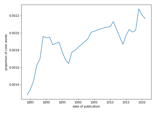
What are the most colorful texts?
A closer look at some of the most colorful works reveals some useful trends. Table 5 below shows the total proportions of color expressions, if the text is more than two standard deviations away from the mean. I’ve annotated this list with some genres, where they are unambiguous. Many of these are childrens’ stories, and are full of bright colors and unfiltered perceptions. Many are collections of folk tales, some of which are for children. Padraic Colum’s are adapted from Irish folk tales, along with many of Lord Dunsany’s, and those alone account for five of the works on this list: both of these Irish writers were in some way involved in the Irish literary revival. Those works, and many others here, also belong, bibliographically, to the fantasy genre, in which highly imaginative, fantastic creatures or settings would need to be described. Many other works in this list involve travel of some sort (although that is perhaps an unsurprising trait of British literature of the early twentieth century). Travel to especially distant places overseas, whether real or imaginary, would also require thick description. Some of Katherine Mansfield’s stories are travel narratives in a different sense: although she writes about New Zealand as a native, she writes about it from England, and from a position of imagining something fictional happening in a very distant place.
| Year | Title | Author | Genres | totals |
|---|---|---|---|---|
| 1918 | The Boy Who Knew What the Birds Said | Colum, Padraic | Juvenile fantasy stories | 0.007085 |
| 1910 | A Dreamer’s Tale | Dunsany, Lord | Fantasy stories | 0.006036 |
| 1921 | Monday or Tuesday | Woolf, Virginia | Short stories | 0.005861 |
| 1915 | Fifty One Tales | Dunsany, Lord | Fantasy tales | 0.005699 |
| 1922 | Jacob’s Room | Woolf, Virginia | Novel, character study | 0.005434 |
| 1908 | The Sword of Welleran and Other Stories | Dunsany, Lord | Fantasy stories | 0.005222 |
| 1919 | Tales of Three Hemispheres | Dunsany, Lord | Tales | 0.004885 |
| 1880 | Greene Fern Farm | Jefferies, Richard | Nature writing | 0.004771 |
| 1922 | Captain Blood | Sabatini, Rafael | 0.004699 | |
| 1898 | The Tragedy of the Korosko | Doyle, Arthur Conan | Travel novel, colonial | 0.004673 |
| 1895 | The Second Jungle Book | Kipling, Rudyard | Stories set in India | 0.004575 |
| 1922 | The Wind Bloweth | Byrne, Donn | Sea romance novel | 0.004568 |
| 1919 | Mary Olivier, a Life | Sinclair, May | Autobiog. novel | 0.004566 |
| 1922 | The Garden Party and Other Stories | Mansfield, Katherine | Stories | 0.004558 |
| 1919 | Living Alone | Benson, Stella | 0.004509 | |
| 1922 | The Hawk of Egypt | Conquest, Joan | Travel novel, Egypt | 0.004494 |
| 1887 | The Frozen Pirate | Russell, William Clark | 0.004362 | |
| 1899 | Findelkind | Ouida | 0.004227 | |
| 1918 | The Return of the Soldier | West, Rebecca | Novel | 0.004213 |
| 1892 | The New Mistress | Fenn, George Manville | 0.004028 |
Note that most of these are post 1910, and in fact, the mean year is 1910. Put differently, of the four decades’ of fiction seen here, from the 1880s to the early 1920s (where this corpus, for copyright reasons, stops), the last full decade is the one which contains the most positive outliers.
Who are the most colorful writers?
In generating the list in table 6 below, I attempted to control for what seem like genre signals. Although not strictly childrens’ works, Padraic Column, Lord Dunsany write tales, folklore and fairy tales, whose colorfulness seem to be skewing the results. So here I improve my genre categorizer described above, by further categorizing all works with the LCSH fairy tales as juvenile (even though, strictly speaking, this isn’t necessarily true).
Still, though, the list remains very similar to the individual title list above. The Irish tale-writers and folklorists Padraic Colum and Lord Dunsany are joined by another, Donn Byrne. Stella Benson, another fantasy novelist whose Living Alone is a fairy-tale novel, appears here, too, alongside Ouida, also a writer of juvenile fiction. Yet these are the works of these writers which are not classified as juvenile fiction, which suggests that their writing style has been affected in some way by their elsewhere writing for children.
Which colors are the most prominent?
One of the first questions I asked of this data set was simply: what is the most common color in British literature of this period? This was, surprisingly, one of the most difficult questions to calculate, and necessitated the color categorization engine described above, since colors like light green needed to be counted as green, and colors like sky needed to be counted as blue. I hypothesized that the most common color here would be red, for its brightness, or green, for its ubiquity in flora. But I was very surprised to see that the most common colors are actually black and white. This is especially true once you keep in mind that not many other colors are descendants of the black and white categories: off-white is not very common in fiction, and neither are various other blacks. Grays belong to their own categories. So what could be causing this literary chiaroscuro?

Astoundingly, the color ranking shown below in fig. 25 follows the Berlin and Kay hierarchy from eq. 4: white is the foremost, then black, then red, and so on. This adds some evidence to the universalist view of the primacy of certain colors. But again, my object here is not to settle any linguistic debates, but to understand more of how color operates in literature.
What makes modernism colorful?
Modernism is colorful for all the reasons I’ve outlined here so far, but so much more. There is its moment in cultural history, including its yellow predecessor; its heightened subjectivity; generic signals, like travel, romance, and juvenile literature; moments of epiphany and ecstasy. I would like to spend some time expanding on two of these stylistic phenomena, however: the genre and style of Bildung, and that of literary impressionism.
Bildung
The genre and subject matter of a literary work has a strong influence on its color and brightness. There are obvious genres, like painters’ novels, which deal directly with pigments, and so should be expected to contain lots of color words and color descriptions. But textual color is correlated with a number of other surprising genres, as well.
A defining genre of the novels of this period is the Bildungsroman, a genre which Franco Moretti famously calls a “symbol” of modernity, in that modernity itself is a kind of society-level youth, self-mythologizing (Moretti 4). I argue that visuality, and color in particular, are crucial to the modernist Bildungsroman. After all, the literal meaning of Bild is image, painting, or figure, and Bildung, usually translated education, means literally image creation or formation. It is no mere coincidence, then, that portraiture and self-portraiture are common themes of these novels, appearing even in the titles of Joyce’s A Portrait of the Artist as a Young Man, Wilde’s The Picture of Dorian Gray, and Pater’s Imaginary Portraits, to name a few. If we count Henry James, then we might add The Portrait of a Lady, and T. S. Eliot’s poem of the same name. Gregory Castle calls these “portrait” novels “portraits of aesthetic life,” and underscores their roots in the aestheticist literary movement, of which Pater and Wilde were visible figures, and which took place in the Yellow Nineties (Castle).
It would make quick work of this study if it turned out that almost all highly colorful works in this corpus come from a single genre, like painters’ romances. So by grouping these text by subject or genre, I can begin to see trends among colorful texts. I first examine correlations between (a) texts’ Library of Congress Subject Headings, and (b) the number of different unique colors the model detects. This is not measuring the number of colors, but their breadth: the creativity with which writers relate their visual domains. Table 7 below shows this correlation.
| Library of Congress Subject Heading | # Unique Colors |
|---|---|
| Love stories | 264 |
| Short stories, English | 215 |
| Psychological fiction | 206 |
| Detective and mystery stories | 206 |
| London (England) – Fiction | 203 |
| Adventure stories | 203 |
| England – Fiction | 196 |
| World War, 1914-1918 – Fiction | 193 |
| Domestic fiction | 192 |
| Short stories | 187 |
| Man-woman relationships – Fiction | 185 |
| Science fiction | 180 |
| Fantasy fiction | 176 |
| Historical fiction | 174 |
| England – Social life and customs – 19th century – Fiction | 171 |
| Sea stories | 166 |
| Young women – Fiction | 152 |
| English fiction – 19th century | 149 |
| Private investigators – England – Fiction | 118 |
The LCSH love stories has the highest number of unique colors in this corpus, by far. This is a large category of mostly novels, containing a number of well-known works. Among these are three novels by D.H. Lawrence, three by Wells (Marriage, Ann Veronica and Love and Mr. Lewisham), and two by Woolf (The Voyage Out and Night and Day).
Love stories are colorful because time (durée in Bergsonian formulation) is softer in love stories. The French literary theorist Philippe Hamon observes that literary descriptions tend to happen when the describing character is “‘absorbed’, ‘fascinated’, ‘loses track of time’, because of what he is looking at,” traits that would apply equally as well to lovers (Hamon 149). The describer “has been able to abstract himself for a while from the plot; the ‘delay’ in the text is justified by a ‘delay’ invoked by the text: an ‘idle period’ in an activity, a ‘breather’, a ‘pause’” (ibid.). This is why love stories among stock brokers or auctioneers are not as common as those among cowboys, or gardeners, since love, like description, is something that grows in ease and leisure—with care, rather than hurry; with the rhythm of the daydream. There are fast-paced sections of Ann Veronica, without a doubt, but it is the slower ones, the ones that deal with the couple’s European vacation, in which descriptions are allowed the freedom to polychromatically shimmer, as in the excerpt shown below:
By this time Capes’ hair had bleached nearly white, and his skin had become a skin of red copper shot with gold. They were now both in a state of unprecedented physical fitness.
And such skirts as Ann Veronica had had when she entered the valley of Saas were safely packed away in the hotel, and she wore a leather belt and loose knickerbockers and puttees--a costume that suited the fine, long lines of her limbs far better than any feminine walking-dress could do. Her complexion had resisted the snow-glare wonderfully; her skin had only deepened its natural warmth a little under the Alpine sun. She had pushed aside her azure veil, taken off her snow-glasses, and sat smiling under her hand at the shining glories--the lit cornices, the blue shadows, the softly rounded, enormous snow masses, the deep places full of quivering luminosity--of the Taschhorn and Dom. The sky was cloudless, effulgent blue.
Capes sat watching and admiring her, and then he fell praising the day and fortune and their love for each other.
It is ironic that Wells’s slightly caricatured portrait of Peter, Ann Veronica’s father, describes him reading “chiefly healthy light fiction with chromatic titles, The Red Sword, The Black Helmet, The Purple Robe, … in order ‘to distract his mind.’” (Wells, Ann Veronica 57), given that the novel is otherwise so colorful. In one scene, Manning professes his love to Ann Veronica by saying: “I want my life to be beaten gold just in order to make it a fitting setting for yours. … Forgive me if a certain warmth creeps into my words! The Park is green and gray to-day, but I am glowing pink and gold. It is difficult to express these things” (252). Wells paints a very bright, colorful scene, in which the lover’s pink skin is glowing with excitement, and his feelings—as shiny and as valuable as gold—emanate from him as if they were colors, and he were a source of light. This all contrasts with the “green and gray” of the inert vegetation against which it is set. Manning’s apology that “it is difficult to express” this shows how this kind of color description is so often rooted in reaching for fresh, unconventional ways of relating one’s visual experience.
That love and vision are close interlocutors is a view shared by H.D., in her theoretical work, Notes on Thought and Vision (H. D. (Hilda Doolittle) and H. D. (Hilda Doolittle)). There, she reminds us that “Socrates’s whole doctrine of vision was a doctrine of love. We must be ‘in love’ before we can understand the mysteries of vision” (22). She illustrates this with an imagined story of “the Galilean,” never explicitly named as Jesus, who
fell in love with things as well as people. He would fall in love with a sea-gull or some lake-heron that would dart up from the coarse lake grass … He looked at the blue grass-lily and the red-brown sand-lily that grew under the sheltered hot sand-banks in the southern winter, for hours and hours. If he closed his eyes, he saw every vein or fleck of blue or vermilion. (28)
This attention to color is that which we expect to read of lovers, in love stories.
But we should remember that love stories are not disproportionately
bright—that is, they don’t have more numbers of colors, simply
more unique colors. If we quantify the total proportions of colors, we
see a different story. Fig. 24 shows a subset of
base color proportions for each LCSH. Here, psychological
fiction is the most prominent, overall, although largely due to the
incidence of black and white. The subject heading
psychological fiction contains no fewer than ten works from
Conrad, two each from Wells, Stevenson, Sinclair, Lawrence, Gissing, and
individual novels from Woolf, West, and Maugham. James Joyce’s
Ulysses is also notably present here.
Conrad’s novels in this category are Heart of
Darkness, The Secret Sharer, An Outcast of the
Islands, Almayer’s Folly, Chance, Lord
Jim, Victory, and The Nigger of the Narcissus.
Gissing’s are New Grub Street and The Odd Women.
Lawrence’s are Women in Love and The Lost Girl,
Stevenson’s are The Strange Case of Dr. Jekyll and Mr. Hyde and
The Master of Ballantrae. Wells’s are The Secret Places of
the Heart and The Invisible Man. Sinclair’s are Life
and Death of Harriett Frean and The Three Sisters. Also
included are Joyce’s Ulysses, David Lindsay’s A Voyage to
Arcturus, Lucas Malet’s The History of Sir Richard
Calmady, Maugham’s The Moon and Sixpense, Neil Monro’s
Bud: a Novel, Wests’s The Return of the Soldier, and
Woolf’s Jacob’s Room.
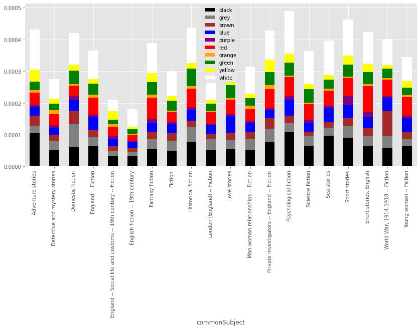
Table 7 shows that the LCSH is somewhat hierarchical: double hyphens separate time periods (nineteenth century), locations (England), and genres (Fiction). Genres also include “drama,” “poetry,” and “juvenile fiction.” I split out these commonly-occurring genre designations, programmatically, to form a new metadata column called “genre”. Then, I compute the same proportions of base colors, and group by these genres. Fig. 25 shows the result of the grouping based on this genre inference.
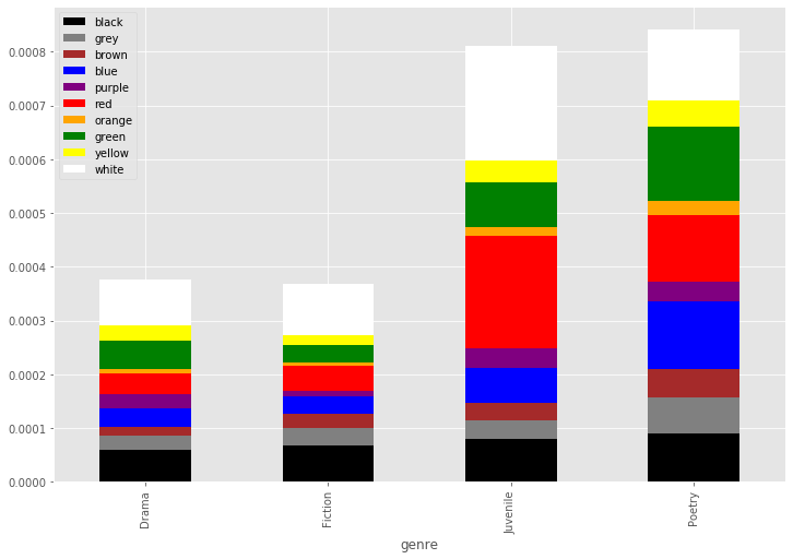
While fiction and drama have roughly the same proportions of colors, juvenile texts and poetry show nearly twice those numbers. This leads me to a theory that the most colorful fiction actually shows something we might call prose poetry. Alternatively, colorful fiction could be evidence of a childlike perceptual state on the part of the narrator.
Mark Doty, poet and author of The Art of Description, writes about what he calls “lyric time,” as a temporal element of the descriptive mode. Here, he notes how it’s a childlike state, in that it evokes a state in which causality and responsibility have not yet been eroded:
Lyric is concerned neither with the impingement of the past nor with anticipation of events to come. It represents instead a slipping out of story and into something still more fluid, less linear: the interior landscape of reverie. This sense of time originates in childhood, before the conception of causality and the solidifying of our temporal sense into an orderly sort of progression. (Doty 30)
Of course, writers of juvenile literature are not themselves children, but are writing to, and from, this state of mind. This is a state which attempts to convey the awe of early visual experiences. Before the names, purposes, and dangers of our immediate surroundings are known to us, they are first colors, sensations.
Milton Bradley argued that “color is one of the earliest subjects which should be taught in any education course,” since “bright color is the first thing to attract the infant’s eye, winning his notice before he pays any attention to form.” (Blaszczyk and Spiekermann 58).
Impression(ism)s
A second stylistic signal, just as important, is one that critics have called literary impressionism. Impressionism proper, the art movement born in 1870s Paris, was a revolutionary style in painting, more concerned with light, visual perception, and the interaction of color, than with strict representation. In fact, one story has it that Roland Rood, on a trip to Paris, found that his father’s book, Ogden Rood’s Modern Chromatics, was considered by many to be “the impressionists’ Bible” (Rossi 24). Modern Chromatics: With Applications to Art and Industry describes a variety of color phenomena: the interaction of colors with each other and their environment, their reflection, their refraction by water, and their absorption by certain materials, to name a few. There is no history of Impressionism that does not describe its love affair with color—especially violet.
As impressionism spread throughout the world, it began to appear in
literature, as well. Critics began using the term literary
impressionism to describe literature, chiefly modernist, which
dealt with sensory perceptions in a fashion analogous to that of the
painters. Some of its first definitions explain it just in terms of the
painting style. One of its earliest definitions, for example, is from
Ferdinand Brunetière, in Le roman naturaliste: “nous pourrons
définir déjà l’impressionnisme littéraire une transposition systématique
des moyens d’expression d’un art, qui est l’art de peindre, dans le
domaine d’une autre art, qui est l’art d’écrire” (Brunetière
88).“We could already define literary impressionism as a
systematic transposition from means of expression in one art, painting,
into another art, the art of writing.”
In discussing a novel by Alphonse Daudet, Brunetière uses
analogies from painting: “chaque scène ainsi devient un tableau, qui
s’arrange comme dans une toile suspendue sous les yeux du lexteur,
complète en elle-même, isolée des autres, comme dans une galerie, par sa
bordure, par son cadre, par un large pan de mur vide” (Brunetière
89).“Each scene becomes a tableau which arranges itself
like a canvas suspended under the eyes of the reader, complete in
itself, isolated from others, as if in a gallery, by its border, by its
frame, by a large expanse of blank wall.”
But by the time the style reaches Britain, literary impressionism has departed from its analogue in painting. It has since been defined in a number of ways. Michael Winkler defines it thus:
One of several stylistic tendencies that emerged during the 1880s from the decline of realistic writing and its reliance on the mimetic function of lit. … Impressionism thus came to share a penchant for subtle nuances, refined perception, and the ornamental use of ‘precious’ images … with poetic Jugendstil and the decorative arts around 1900; its preference for the openness of allusive hints over conceptually fixed meaning and its fluid suggestion of atmosphere through a quick succession of sensory impressions were made possible at the expense of a clearly delineated world of concrete objects and have also be called ‘neoromantic’. (Winkler 579–80)
This definition could certainly apply to a number of modernist writers. Literary impressionism as a style or distinction came to be used, in the first decades of the twentieth century, of a litany of writers who deal with color, or the ocular. Rebecca Fowler’s Literary Impressionism treats visual and ocular aspects of the works of Dorothy Richardson, Ford Madox Ford, H.D., and May Sinclair (Bowler). Jesse Matz’s Literary Impressionism and Modernist Aesthetics deals with James, Hardy, Proust, Conrad, Ford, and Woolf (Matz). Maria Kronegger’s Literary Impressionism reads French writers such as Gide, Flaubert, Proust, and Sartre (Kronegger). The term was used so often for writers of the day that it seems to have annoyed Skard, who defines the style thus:
The third movement which strove to replace Naturalism, Impressionism, was strictly speaking no movement of reaction but tried to deepen and intensify the Realistic means of expression and at the same time sublimate them. Impressionism has been en vogue in the literary research of recent decades; one early writer after another has been registered as Impressionist, from La Fontaine down. Many of these attempts—for instance, Carlowitz’ efforts to make Goethe an Impressionist … doubtlessly are over-strained … (Skard 202)
There is a strong subjectivity implied in the term impression: it is a sensory perception as perceived. Thus, much of literary impressionism, and thus its textual color, takes place within a certain point of view. We have just seen a strong example of this in Joyce’s Portrait, which ends with Stephen’s journal. Journals and diaries abound in fiction of this period, where the form is used to the the writer’s advantage. Maria Kronegger argues that this form is crucial to literary impressionism:
Writers of diaries, notebooks, and memoirs have the advantage of making everything proceed from a certain instant: according to the moment, they can change writing styles, that is the manner of suggesting reality; they can change point of view in order to capture thee most volatile moments of life together with nuances of color and tone, and to seize in passing the variations in aspect which the same scene assumes at different moments; they can reveal the development of awareness of the protagonist. (Kronegger 51)
This changing point of view—perhaps more analogous to painterly cubism than to impressionism—is a style we see in Joyce’s Portrait and Ulysses, Woolf’s Mrs Dalloway. Before all of those, however, there was Dorothy Richardson’s Pointed Roofs, an exemplar of literary impressionism, remarkable in its subjectivity and its sensory detail. It exhibits very high proportions of color expressions throughout.
J.D. Beresford, who writes the introduction to the first edition, doesn’t quite know what to make of its point of view, at first. When he reads the novel in manuscript, he decides it “was realism, was objective” (Richardson et al. 257). The second time, however, when he reads the novel in typescript, he decides “it is the most subjective thing I have ever read.” He imagines that “the writer of this has gone through life with eyes that looked inward; she has known every person and experience solely by her own sensations and reactions” (Richardson et al. 258). The third time he reads it, however, he is enlightened: he entirely suspends his judgment about its objectivity or subjectivity.
May Sinclair’s introduction to Pointed Roofs agrees with Beresford, and polemicizes his view. It reads almost like a manifesto for literary impressionism. Sinclair writes:
It seems to me that the first step towards life is to throw off the philosophic cant of the nineteenth century. I don’t mean that there is no philosophy of Art, or that if there has been there is to be no more of it; I meant that it is absurd to go on talking about realism and idealism, or objective and subjective art, as if the philosophies were sticking where they stood in the eighties. (Richardson v)
Sinclair’s introduction will make literary history, as it is the first time the term “stream of consciousness” appears. Describing Richardon’s Pilgrimage series, which Pointed Roofs begins, she writes: “in this series there is no drama, no situation, no set scene. Nothing happens. It is just life going on and on. It is Miriam Henderson’s stream of consciousness going on and on” (Richardson ix).
As with Joyce’s coloured narrative, the point of view is not entirely interior, or exterior. Here is a section from the first pages:
The organ was playing "The Wearin' o' the Green. "
It had begun that tune during the last term at school, in the summer. It made her think of rounders in the hot school garden, singing-classes in the large green room, all the class shouting "Gather roses while ye may," hot afternoons in the shady north room, the sound of turning pages, the hum of the garden beyond the sun-blinds, meetings in the sixth form study.... Lilla, with her black hair and the specks of bright amber in the brown of her eyes, talking about free-will.
She stirred the fire. The windows were quite dark. The flames shot up and shadows darted.
The song, and its usage of green, triggers, like Proust’s madeleine, a flash flood of memories. Miriam’s nostalgic reverie recalls for her the sights, sounds, and temperatures of her youth. Light is a crucial ingredient here, in the “shady north room,” with the “sun-blinds,” the “fire,” its “flames” and its “shadows.” Color pairs link the past and the present: the green of the song with the green of the classroom; Lilla’s amber-flecked eyes and the flames of the fire; Lilla’s black hair and the dark windows.
Love is at play here, again, creating a mood of wonder which allows these sensory perceptions to come to the fore. After quoting an exceptionally colorful passage from Richardson’s Honeycomb, Sinclair writes: “it is as if no other writers had ever used their senses so purely and with so intense a joy in their use” (Richardson xii).
Coda
Here we have modeled one aspect of visuality: color. This was an exceedingly complex task, owing to the gaps, fissures, and stumbling blocks inherent in the human vision/word interface. But along the way we have discovered a number of useful properties of textual color, that then feed back into the model, which, in turn, prompt new questions, and reveal more about visuality in modernist literature. We have completed a cycle of Box’s loop.
In the next chapter, I will model the second type of retinal cell: rods, which are responsible for the perception of shape. Just as I’ve used textual color to find generic and stylistic resonances in modernism, so I will use shape, size, and body to identify patterns in the literature of this period.